How to Create a Layout Component
Layouts are a unique type of component within PageBuilder Engine - they serve as wrappers for the body of the webpage you are building, and they can encompass all other components (except output types) that may exist on the page. While Layouts are not required for PageBuilder Engine to render a webpage, they can be a handy tool to provide structure and style to your webpage.
Hierarchy of a PageBuilder Engine webpage
An entity-relationship diagram of the different components that can exist on a PageBuilder Engine webpage looks like this:
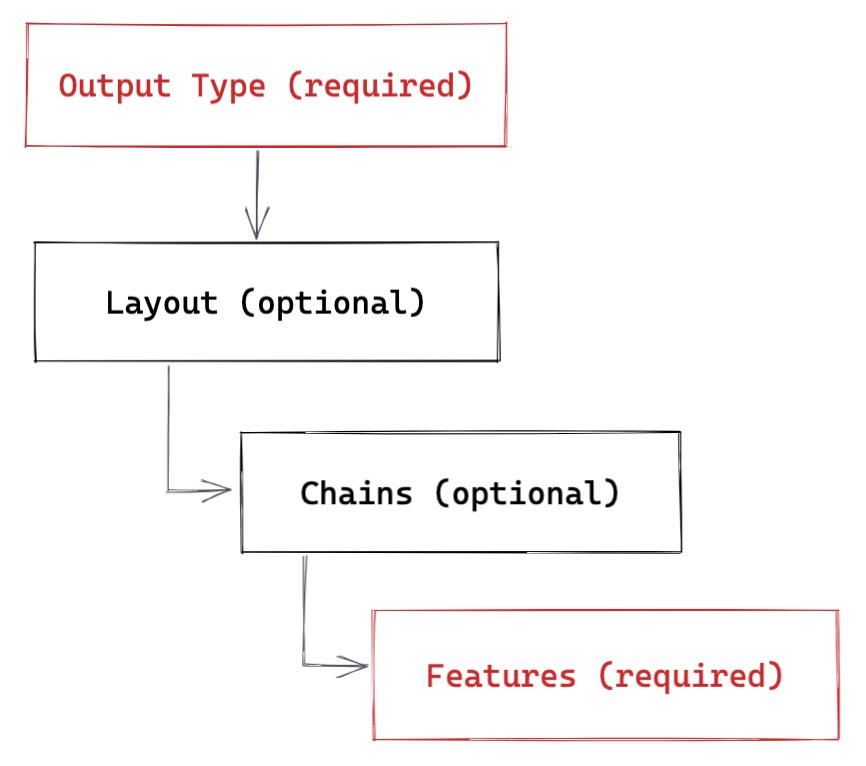 |
This diagram illustrates a few guidelines about how a page should be structured in PageBuilder Engine:
Every PageBuilder Engine webpage requires a single Output Type that serves as the root of the webpage.
Every PageBuilder Engine webpage should contain Feature(s) at some point - while this is not enforced, it would be pretty pointless to make a webpage without any Features.
Output Types can have exactly one Layout per webpage, but don't have to. An Output Type could directly include Features and/or Chains and skip the Layout.
Chains can include Features, but are also optional. See How to Create a Chain Component.
So while we don't need a Layout component for our webpage to render, we can create one to serve as a container around the rest of the Features and Chains on our webpage.
How Layouts work
Layout components are divided into named "sections" defined in the component itself, which act like containers for Features and/or Chains. Then in the PageBuilder Admin, editors can drop the Features and Chains they'd like to exist on the page into the appropriate sections. There are multiple different ways to define a Layout component in PageBuilder Engine - a Layout can be as simple as a mapping of section names to some HTML classes, or as complex as full React component with structured JSX.
Creating a simple Layout
If all you'd like is to list the sections your layout should contain and assign some classes to the containers for CSS purposes, your Layout can be a simple array of objects with the properties id, cssClass (or className alternatively), and element (this is optional, PageBuilder Engine defaults to a <section> if not specified). We could define the following Layout inside the /components/layouts/ directory named basic.jsx:
/components/layouts/basic.jsx
export default [
  {
    id: 'header',
    cssClass: 'col-xs-12 fixed-on-small',
    element: 'header'
  },
  {
    id: 'main',
    cssClass: 'col-xs-12 col-md-9',
    element: 'article'
  },
  {
    id: 'sidebar',
    cssClass: 'col-xs-12 col-md-3',
    element: 'aside'
  },
  {
    id: 'footer',
    cssClass: 'col-xs-12',
    element: 'footer'
  },
]
This Layout would then result in HTML resembling the following on the webpage:
<header id="header" class="col-xs-12 fixed-on-small">
  // Header Features/Chains
</header>
<article id="main" class="col-xs-12 col-md-9">
  // Main Features/Chains
</article>
<aside id="sidebar" class="col-xs-12 col-md-3">
  // Sidebar Features/Chains
</aside>
<footer id="footer" class="col-xs-12">
  // Footer Features/Chains
</footer>
This Layout, while uncomplicated, provides some simple class name wrapping around the different sections of our page that we can apply styling to. In the PageBuilder Admin, editors will see the section names header, sidebar, main and footer available to drop Features and Chains into.
There is even more syntactic sugar for defining simple Layouts outlined in the Layouts API documentation.
Creating a JSX Layout
However, sometimes you'll want more control over the structure of your Layout and its markup. For these situations, it's possible to define a Layout as a React component. Let's define a slightly more complicated Layout called article-right-rail.jsx:
/components/layouts/article-right-rail.jsx
import React from 'react'
const ArticleRightRail = (props) => {
return (
<div className='row'>
<header className='col-12 fixed-on-small'>
{props.children[0]}
</header>
<section className='col-12'>
<div className='row'>
<article className='col-xs-12 col-md-8'>
{props.children[1]}
</article>
<aside className='col-xs-12 col-md-4'>
{props.children[2]}
</aside>
</div>
</section>
<footer className='col-12'>
{props.children[3]}
<p>Copyright © 2018</p>
</footer>
</div>
)
}
ArticleRightRail.sections = ['header', 'main', 'sidebar', 'footer']
export default ArticleRightRail
In the above component, we've defined a Layout that has four sections, just like our initial basic Layout. However, in this Layout we're able to structure the HTML however we want, add in extra elements (like the <p> in the footer) and then inject the child Feature and/or Chain components through props.children. For Layouts, props.children is an array of objects ordered by the list of section names provided in the component's .sections definition. We've also added some Bootstrap classes so our layout will work properly.
The .sections property here is necessary to provide the PageBuilder Admin with the names of the sections available in this Layout - without it, editors won't know which section they are dragging and dropping Features into.
We could keep on defining Layouts and making them available in PageBuilder Admin, but for now one is enough.
▶ Next: How to Create a Chain Component