Navigating PageBuilder Editor
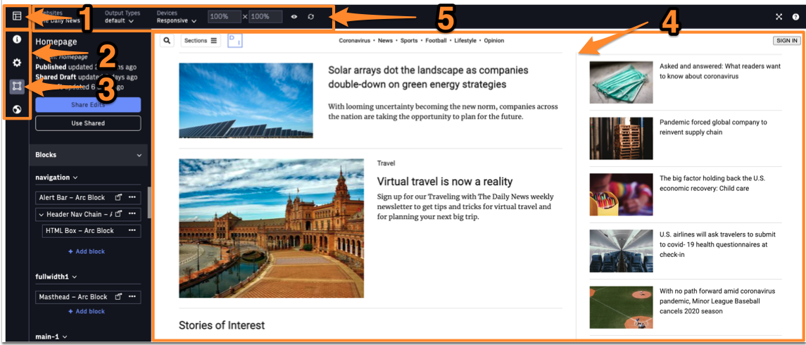 |
1. PageBuilder Landing - Clicking here will take you back to the main PageBuilder Editor landing page where you can see the list of all Pages (or Templates).
2. Workspaces Bar - These four icons represent different Workspaces within PageBuilder Editor (Information, Set-up, Curation, Publication) and you can switch between them here.
3. Curate Workspace - For most users, the Curation Workspace is where they will spend the majority of their time in PageBuilder Editor. From within this Workspace, you will curate content, add features/chains, and see how these updates are reflected in the Preview.
4. Editor Preview - This is the preview of the changes you're making to your draft of the page. You will see real-time updates as you switch out content, add or remove elements, change custom fields for the features, and more. The Editor Preview does not show ads.
5. Editor Tool Bar - Within this toolbar, you'll find dropdown menus to do the following: see your draft of the page as rendered on any sites where it's published, select a default or amp output type, and see how the page will lay out across various devices. You may also create and view a customized aspect ratio from the Editor Tool Bar. The Devices and customized layouts do not show any specific content (such as exclusive mobile content). These options are meant as an aspect ratio guide to help visualize design and layout.
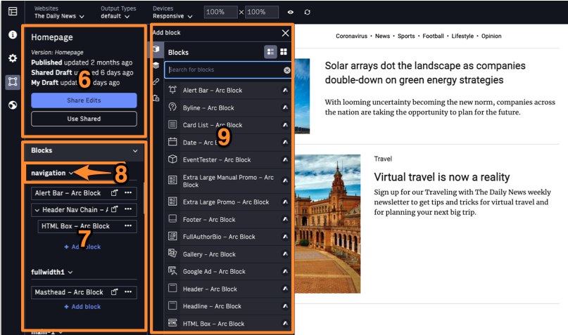 |
6. Status Card - This status card will persist throughout all the Workspaces in PageBuilder Editor. It will give you the most up-to-date information about the live version of the page, the Shared Draft (the shared draft of the page found at the server level), and your personal Draft of the page. From here, you will also have the option to "Share Edits" (push your edits to the page to the Shared Draft, essentially saving the page for all to see but without publishing it) and "Use Shared" (undo any changes you've made to your personal Draft by reverting to the Shared Draft of the page).
7. Blocks (and Chains) Card - Within the Curation Workspace, you'll see the "Blocks" card along the left-hand side of the page. From here, you can see the different layout zones or regions of your page and the features and chains that comprise your page. By hovering over the name of a block or chain here, you will be taken to that block/chain within the preview.
8. Layout Zone - These are the regions of your page, as determined by the Page Layout you've established from within the Set-up Workspace. These page layouts are created and driven by your organization to provide you with flexibility when it comes to designing and laying out your content.
9. Add Block or Chain Modal - By clicking on "Add Block" from within the Features Card, you'll launch this Add Block or Chain modal. From here, you can add a block or chain from your respective lists of options, you can add linked blocks or chains from other pages, or you can add blocks or chains that have been saved to the Clipboard.
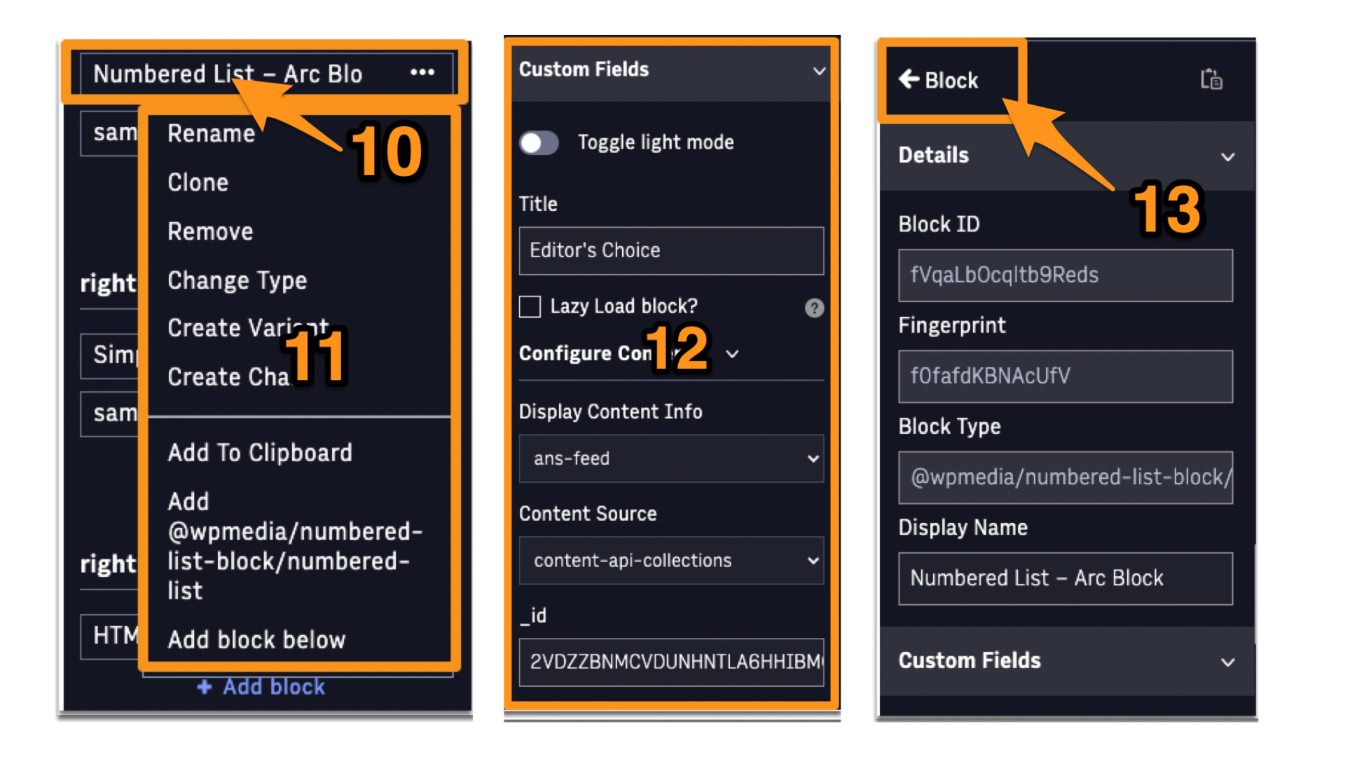 |
10. Block/Chain Actions Menu - This three-dot menu provides Block/Chain Actions (see below for specific actions).
11. Block/Chain Actions - Here you will see the actions available for you for that block or chain. You can rename the feature from here, add it to the Clipboard, remove (delete) it, clone it, change the type of block or chain, and more.
12. Card - When you click on a block or chain, you will be taken to the Card for that item. From within the item's Card, you'll see that block's metadata, some custom fields for curation purposes, and linking options for that block.
13. Back to Blocks and Chains - To return to the main Curation Workspace from the Card interface, you may click on the "Blocks" button at the top of the Card.