Getting Started with Photo Center
Welcome to Arc XP Photo Center. Below we will walk through how to manage a central library of images, Galleries (also called slideshows), and internal-facing Lightboxes.
Unlike articles, videos, or galleries, images are not a top-level content type in Arc XP, meaning they are almost always associated with or embedded in one of the top-level types listed above. This means that there is no "circulation" option for images, and therefore, there is no website association. To control access/visibility of images based on the website, see this documentation about distributors/restrictions.
Navigating Photo Center
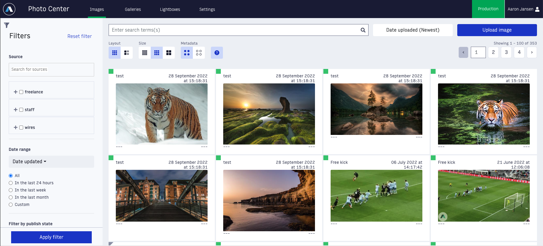 |
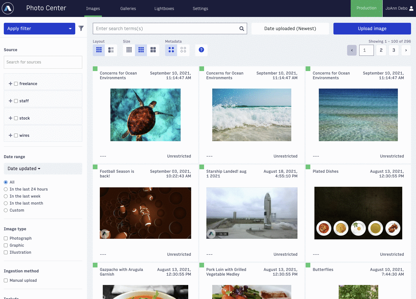
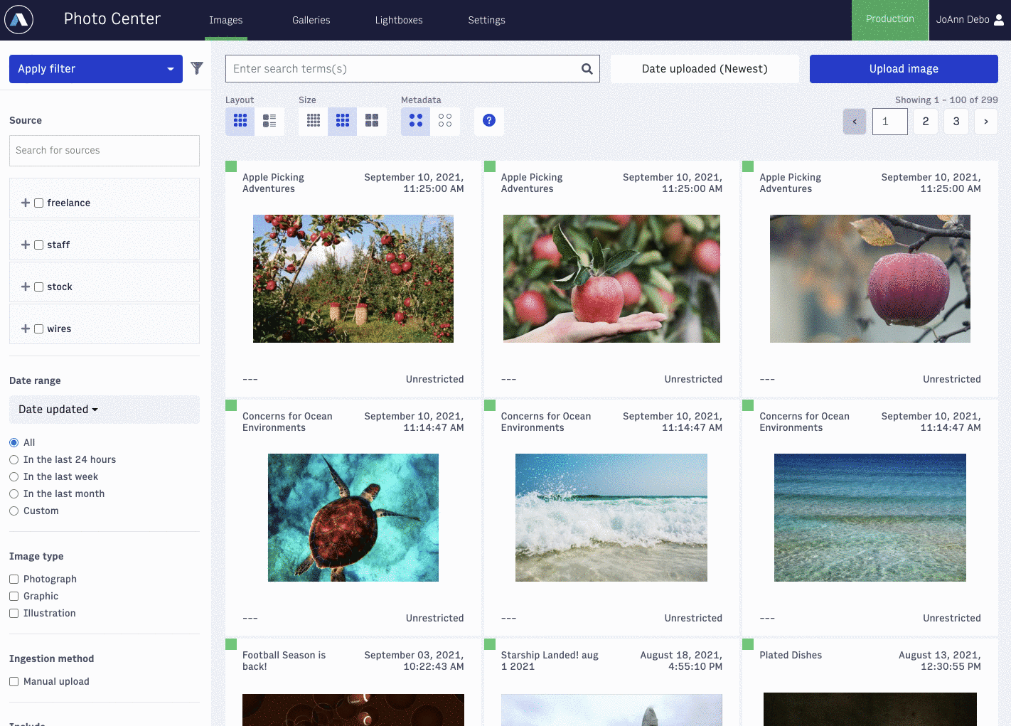
When you first open Photo Center, you will land on the "Images" tab, where you can see your image library. Like most apps, there will be some filtering options along the left side. "Source" will give you options based on the "Distributors" you have set for your images. For more on distributors, click here. Below that, you will see date ranges, publish state, image type, and more. You can also filter what fields you are searching for in the search at the top of the screen.
Moving to the main section of the page, the search bar at the top will, by default, search the following fields:
Headline
Caption
Slug
Photographer/Creator
Keywords
ID
Original Name
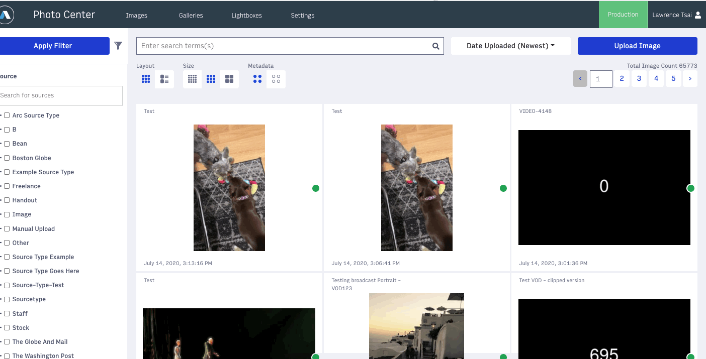 |
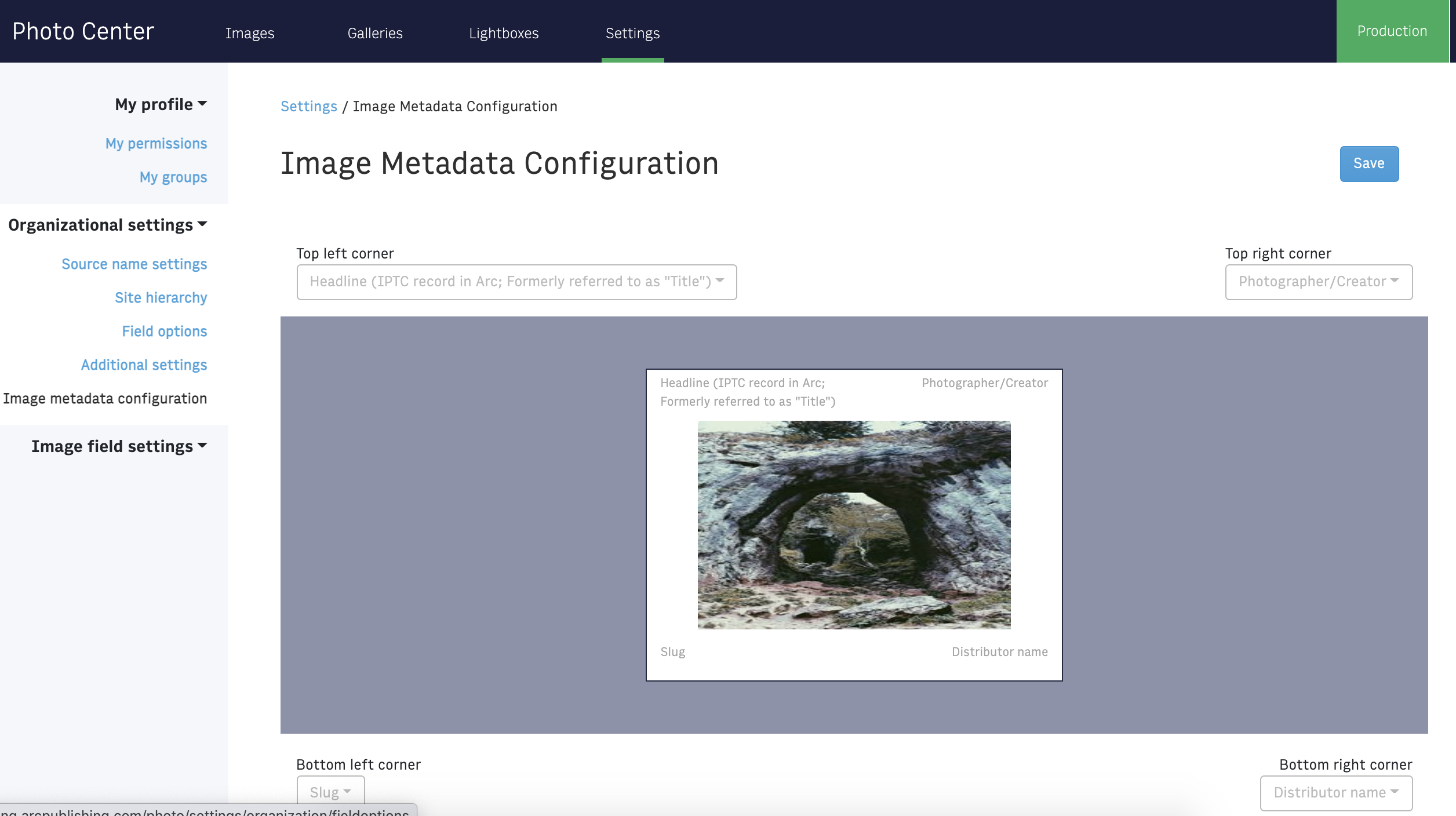
Below that you will find some toggles to control how your image cards look - layout, size of thumbnails and if certain metadata is exposed in the corner of the image card. To adjust the metadata fields populated in each of the 4 corners, you can adjust them in Settings > Organizational settings > Image metadata configuration:
Note
You need Settings permission to edit any Settings.
 |
Uploading an image
Note
Photo Center supports the upload of .jpg, .png, .gif (and animated .gif), .bmp, .webp, and .tif files. It does not support uploading other file types, including .svg, .eps, .pdf, or .avif.
To add images, simply select the blue “Upload image” button in the upper right corner and select the image(s) you would like to bring into Photo Center. If your organization is using image templates, you may be prompted to select the appropriate template for the images you are uploading. Once you’ve chosen the images to upload, click “Upload” and you will see the status bar for your uploading progress. When the images are 100% uploaded, you will be automatically taken to the “Edit image details” screen. If you have selected more than one image, you will see smaller thumbnails below the large preview image on the left. You can toggle between them by clicking on the small previews or by clicking on the left and right arrows in the main preview.
 |
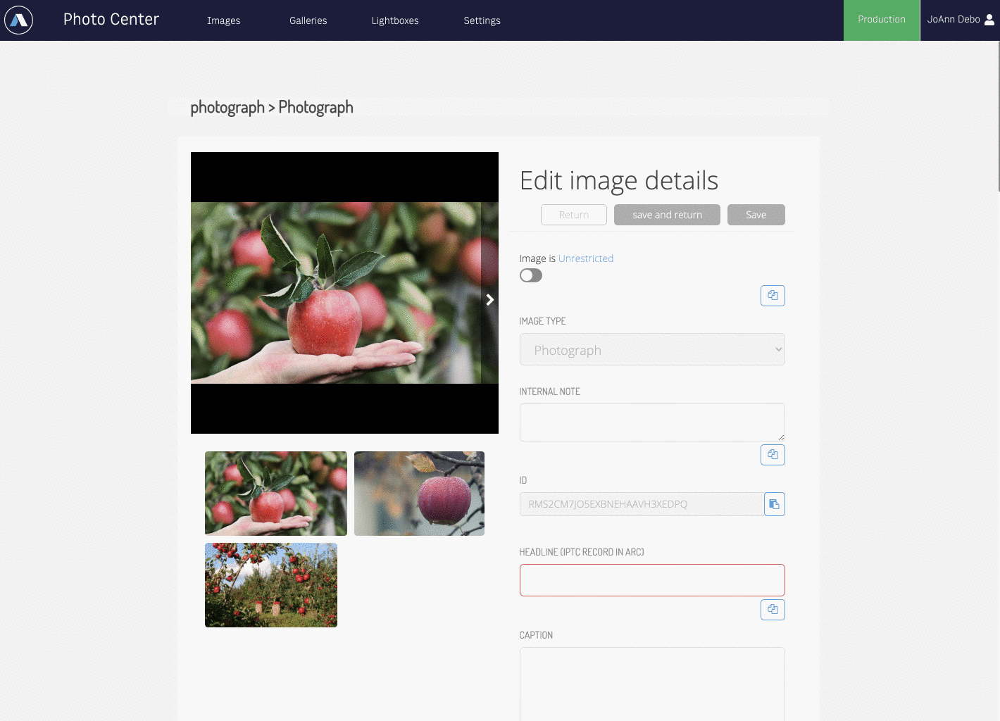
On the right side of the screen, you will see a number of meta fields to be filled out, depending upon your organization’s workflow and requirements. Some of these metadata fields include headline, caption, alt text, photographer(s), keywords, usage instructions, and more. If the uploaded image has IPTC metadata associated with it, that information will populate into these fields. There is also a small “Copy to all” button under each field, which will allow you to associate that metadata with all the images in the batch. If a field is required in order to save, it will be outlined in red. If that field is not filled for all images in the batch you’ve uploaded, you will not be allowed to save your images.
Once you have added all the info you would like, you may click “Save” at the top of the screen to save your information and continue working in this screen or “Save and return” in order to save your work and return to the main Photo Center image library.
 |
Editing Metadata
If you click on the pencil icon, either by hovering over the image or on the image details page, you will pull up that image’s edit screen. Here you can edit most of the meta fields associated with that image; some fields lock once the image is saved and will appear grayed out. From this screen you can also publish or unpublish the image.
 |
You may also bulk edit images by hovering over each image you wish to edit and clicking the white check box. A blue menu bar, featuring options to delete, publish, edit, or add to a Gallery or Lightbox, will appear at the bottom of the page. To bulk edit the metadata for the images you’ve selected, click on the pencil icon and you will be taken to the “Edit image details” screen to make your changes.
 |
Galleries
A Gallery, or sometimes called a slideshow, is a content type that allows you to combine multiple images together that can either be a standalone piece on your site or as an embeddable element in a story... or both.
Start by clicking on the Galleries tab at the top of the Photo Center screen. Here you will see a list of all of your galleries (based on your website permissions) and some filtering options. To create a new gallery, click the blue "Create Gallery" button in the upper right corner. This will take you to a split screen where you will see all the metadata options on the left and the list of included images on the right.
Adding images
When all of that information is filled out, now it’s time to add your images into the gallery. Select the “Add Images” button to pull photos that are already in Photo Center or you may also choose the “Upload New Images” button and pull in new images.
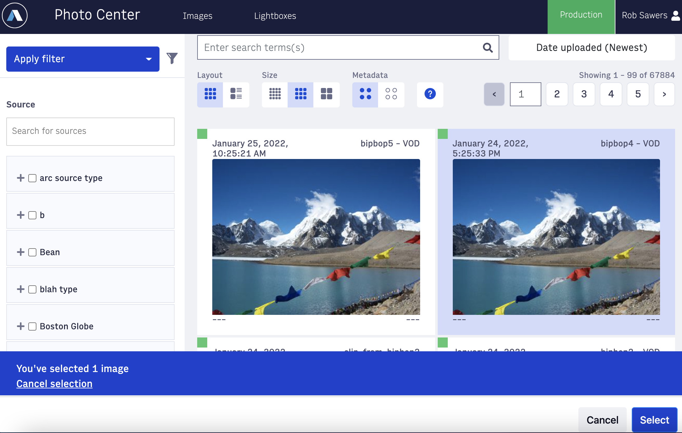 |
Select the images you would like, then indicate whether you would like the images to be placed at the beginning or the end of the gallery. If you upload multiple images at once, the ordering of those images in the gallery is determined by which image finishes uploading first. The images may then be dragged around to get the desired order.
Now that you have the list of images you want to use for your gallery, click on the ellipsis button on the upper-righthand corner of the image tile to see extra options. Here you can:
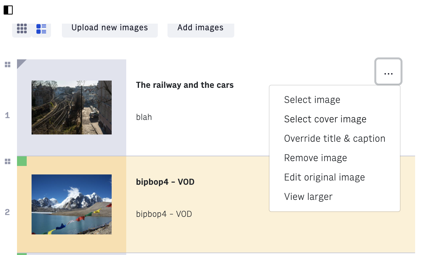 |
Lastly, you can update the gallery’s workflow status, and Save and Publish your gallery with the buttons in the top right-hand corner.
Lightboxes
Lightboxes are a way to internally organize and collaborate around a collection of images within Photo Center. Two common user cases for this would be - 1) you have a large collection of images for a particular story and you want to gather them all into one place and communicate preference or other details. 2) The second is to collect images around a theme, such as you want to put all of your generic images involving police cars, so when there is a breaking crime story, you have a variety of images that are easy to grab quickly. While lightboxes are created and maintained in Photo Center, they are exposed in Composer to make accessing them while created a story a snap.
Creating a Lightbox
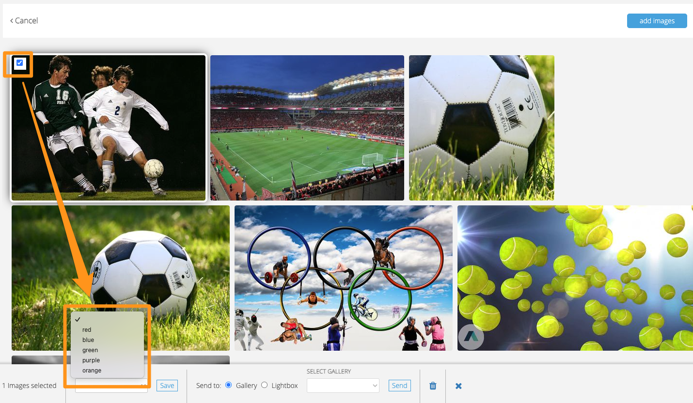
Inside Photo Center, click “lightboxes” in the top menu bar, then the green “New lightbox” button. Name your lightbox and click “Save”. The screen will change and push “add photos” and select the images you would like. Once the images have been added to the lightbox, you can select them (single or multiple images) to bring up a secondary menu at the bottom of the page to add a color border to the image, send to a gallery or another lightbox, or remove them from the lightbox. The colors are there to be able to distinguish between the images, for example you could use the colors to say “use the green one first” or “we are not using the red images right now”.
 |
Selecting images from a lightbox through Composer
When adding a photo to a story in Composer, you can select the “lightboxes” in the top menu to get access to any lightboxes you have created in Photo Center. Inside the lightbox, you will be able to see the color you have marked your images with. Simply highlight the image you would like to select from that lightbox and click the green "Select" button in the bottom right corner.