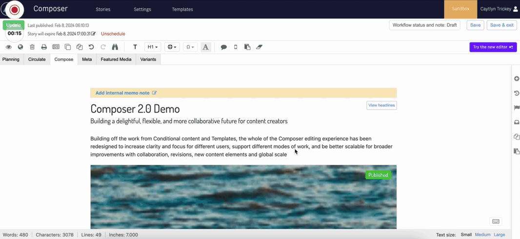
Composer 2.0
Welcome to Composer 2.0!
Composer 2.0 overhauls the editing experience to bring you enhanced clarity, efficiency, and collaboration tools. Say hello to a sleek new interface designed to enhance your productivity and creativity.
Here’s what’s new in Composer Editor 2.0:
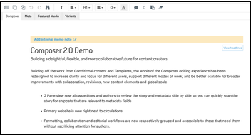
Reorganized Actions and Content: Say goodbye to clutter. Our two-pane view now lets you effortlessly review your story and metadata side-by-side, streamlining your editing process like never before.
Improved Content Elements: We’ve condensed content cards to save screen real estate and enhanced the information architecture on content elements for seamless editing. No more endless scrolling or hunting for options.
Improved Comments: Our modernized comment design ensures a smoother commenting experience. No more searching around. Instead, add comments directly from the contextual format bar and reply to threads with just a click.
Enhanced Feature Media Experience: Find and add featured media with ease. We now display media types upfront for effortless selection and ensure consistent data points across your content.
Additional Enhancements: From removing unnecessary revisions being created, removing extra decision points in your workflows, float indicators, flexible forms, and improved notifications, we’ve fine-tuned every aspect of Composer Editor for a smoother, less distracting editor experience.
View full list of Composer 2.0 enhancements
Primary story actions
The primary story actions now appear separate from other miscellaneous actions that caused clutter and confusion when you needed to find what you needed. The new story header organizes all your key story information and actions in one location. From left to right, you can see the story name, publish status and time, an overflow menu for other actions, story preview, WebSked, actions, and Save and Publish actions.
Composer 1.0 header | Composer 2.0 header | ||
|---|---|---|---|
|
|
Story name and Save and Publish time
To help you more easily orient yourself, the story name now appears at the top of the page. Additional status information, like last save time, publish time, and expiration dates, scheduled dates now also appear at the top of the page. Previously, last save date did not appear in the header.
Overflow menu
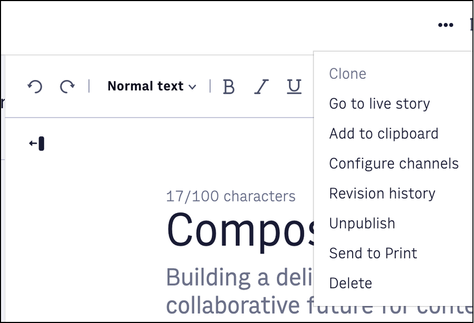 |
The editor overflow menu contains secondary or destructive actions, compared to the primary actions like Save and Publish. This menu contains:
Clone
Go to live story
Add to clipboard
Configure channels
Revision history
Unpublish
Send to Print
Delete
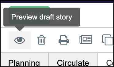
Preview story
The new preview icon appears in the editor menu and functions the same, taking you to the preview URL. You can configure the preview functionality in Composer settings.
Composer 1.0 preview story | Composer 2.0 preview story | ||
|---|---|---|---|
|
|

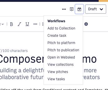
WebSked actions
Note
WebSked actions appear only if enabled in settings.
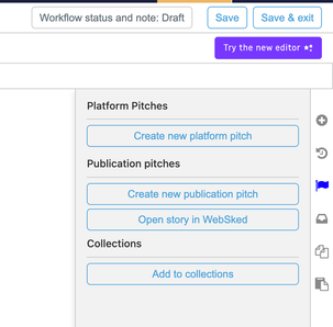
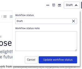
WebSked actions are now consolidated to the top bar rather than the right sidebar.
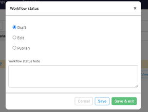
Workflow status is now an expanded drop-down menu instead of a modal, and the same actions remain available.
The adding to collection, creating pitching, creating tasks, and viewing summary actions still appear in a right sidebar.
Composer 1.0 WebSked actions | Composer 2.0 WebSked actions | ||
|---|---|---|---|
|
| ||
|
|
Save and Publish
Saving stories
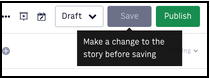
You now both save and publish stories on the right
Requirements to save are still appear on hover
Changes must be made in order to save
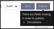
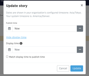
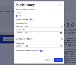
Publishing stories
You can now set an expiration date from the publish window
All other functionality remains the same for choosing to publish now or later or modifying the display date
Unpublishing stories
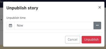
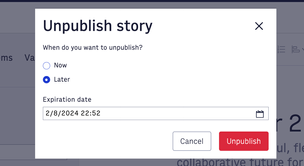
You can now unpublish immediately or set an expiration date
Scheduled Publish and Unpublished dates
These statuses now appear in the workbar for ease
Composer 1.0 scheduled publish and unpublish | Composer 2.0 scheduled publish and unpublish | ||||
|---|---|---|---|---|---|
|
| ||||
|
| ||||
|
|
Story details pane
A new story details pane houses the Planning, Metadata, Featured Media, Related items, Variants, and Clipboard tabs. As a whole, these tabs are now more consistent and now have expandable and collapsible sections.
Planning tab
What appears in the Planning tab is controlled through Composer Settings and varies by organization. We consolidated Circulations next to Primary website instead of having another tab.
Composer 1.0 Planning tab | Composer 2.0 Planning tab | ||
|---|---|---|---|
|
|
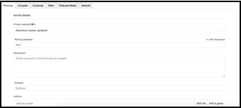
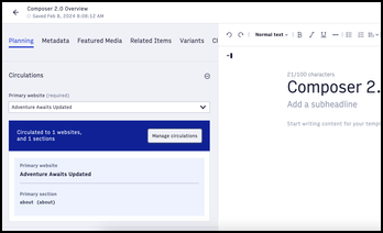
Circulations displayed under Primary Website
Primary website auto-populates selections in the Circulation selector
Additional headlines now appear where Working Headline was in 1.0 and are no longer in the Editor pane (Compose tab)
Metadata tab
What appears in the Metadata tab is controlled through Composer Settings and varies by organization, and this tab received no specific changes.
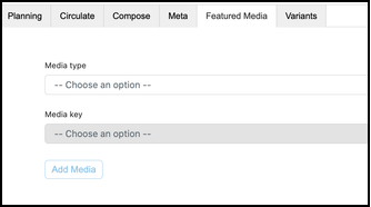
Featured Media tab
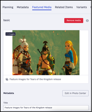
The Featured Media tab now display buckets for each media key instead of the global select in editor 1.0. You still define these media keys in Composer Settings. You can now add content to any of these buckets, as needed.
You can now easily see which types of media are in each bucket.
Content element cards now have consistent data points from Related items and Featured media
Basic, which is the most commonly used type, always appears first. Previously, basic was buried under other options.
Composer 1.0 Featured Media tab | Composer 2.0 Featured Media tab | ||
|---|---|---|---|
|
|
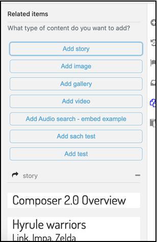
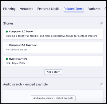
Related Items tab
Related Items is now a tab in the story details pane rather than the right sidebar in editor 1.0.
Similar to Featured Media, the tab displays buckets for each related item type instead of the global select from editor 1.0.
Related stories have an updated design so it’s easier to tell if the story is published and what the headlines are.
Content element cards now have consistent data points from Related items and Featured media
Composer 1.0 Related Items tab | Composer 2.0 Related Items tab | ||
|---|---|---|---|
|
|
Variants tab
Variants remain unchanged from editor 1.0; however, they now live as a tab in the story details pane. Note that story variants must first be enabled in your account. Contact Arc XP Customer Support.
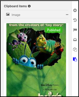
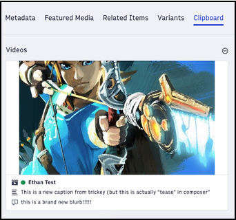
Clipboard tab
Clipboard items are now also accessible from the Clipboard tab in the story details pane rather than the right sidebar in editor 1.0. Clipboard has remained largely unchanged other than some stylistic updates. For instance, content element cards now have consistent data points from Related items and Featured media.
Composer 1.0 Clipboard | Composer 2.0 Clipboard tab | ||
|---|---|---|---|
|
|
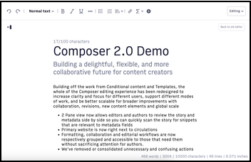
Editor pane (formerly the Compose tab)
The new editor pane replaces the Compose tab and allows for a side-by-side view of the story content.
Composer 1.0 Composer tab | Composer 2.0 editor pane | ||
|---|---|---|---|
|
|
Fixed formatting bar
Formatting and content creation options are now separated from main story actions so you can focus on the options that matter to you in the editorial process.
Composer 1.0 formatting bar | Composer 2.0 formatting bar | ||
|---|---|---|---|
|
|
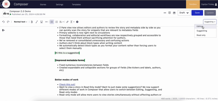
Modes of work
The new modes of work drop-down menu lets you decide which mode of work you want to be in.
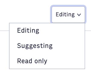 |
Edit mode
Edit mode is the default mode when you enter a story. In Edit mode, you can make any changes or additions you need to.
Suggesting mode
Suggesting mode repurposes editor 1.0’s Inline Comments function, behaving identically. When you’re in Suggesting mode:
suggestions in a published story are not rendered on the front-end story
new content appears as the former inline comments function
deleted content appears with a strike-through for the author to review
 |
Read Only mode
Read Only mode lets you review a story without maintaining the lock.
Comments
Commenting is now more streamlined, appearing only on the left-hand side of the screen and only when you click into commented text. Responding to comments also works much more logically.
 |
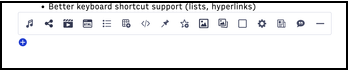
Adding content elements from new lines
You now have updated styles for adding content elements, and the content elements no longer overlay on the line itself, but instead display above the text.
Composer 1.0 content elements bar | Composer 2.0 content elements bar | ||
|---|---|---|---|
|
|
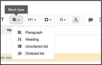
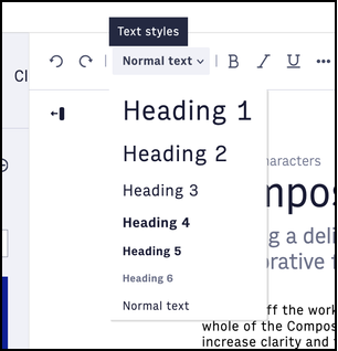
Content elements
All content element availability is still based on Composer Settings, but we’ve made a number of improvements around the information architecture, how you make overrides, and how you move content elements in the story body.
You can now cut and paste content elements in the story body
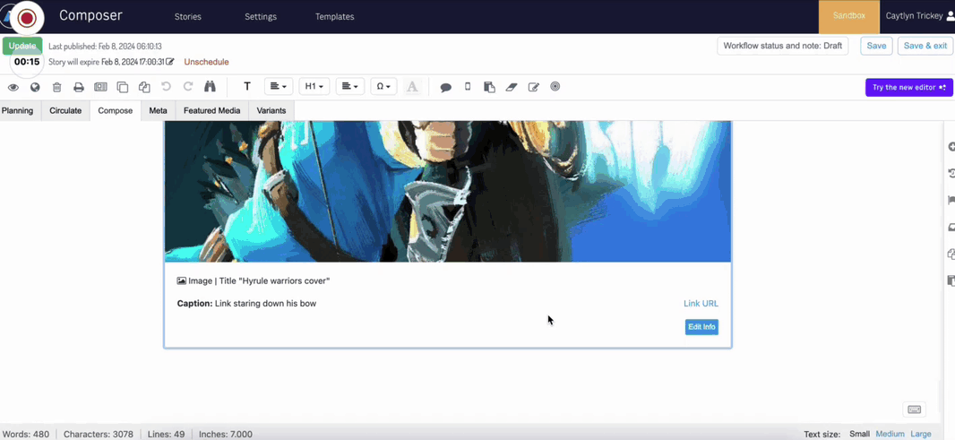
Content elements now have a fixed size so you don’t have to scroll to view extremely large images or to add content after the element
 |
Content elements are more consistent in how information appears. For example, all the data points appear beneath the previews, and content element displays are consistent across inline additions, featured media, related items, and clipboard items.
It’s now easier to take action on content elements. Previously, you had to find these actions in the menu bar. Now, you click directly into the element and choose your action.
 |
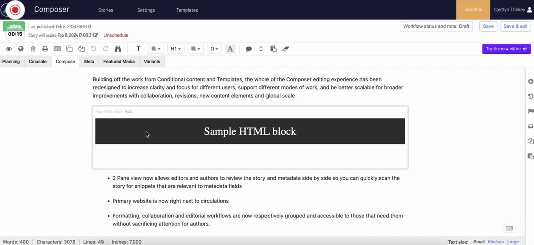
HTML blocks
HTML blocks no longer display random placeholder code
You can now edit HTML blocks without having to click a button
HTML blocks now offer a show-and-hide HTML preview function
 |