Themes - Using Content Item Blocks
Content Item blocks are used to showcase single Arc content items on a standalone page – like an article, a video, or a gallery.
Article Body – Arc Chain
Note
While the block is called Article Body, this block uses data from the ANS story content type.
 |
Key features
Support for these article elements that Composer supports:
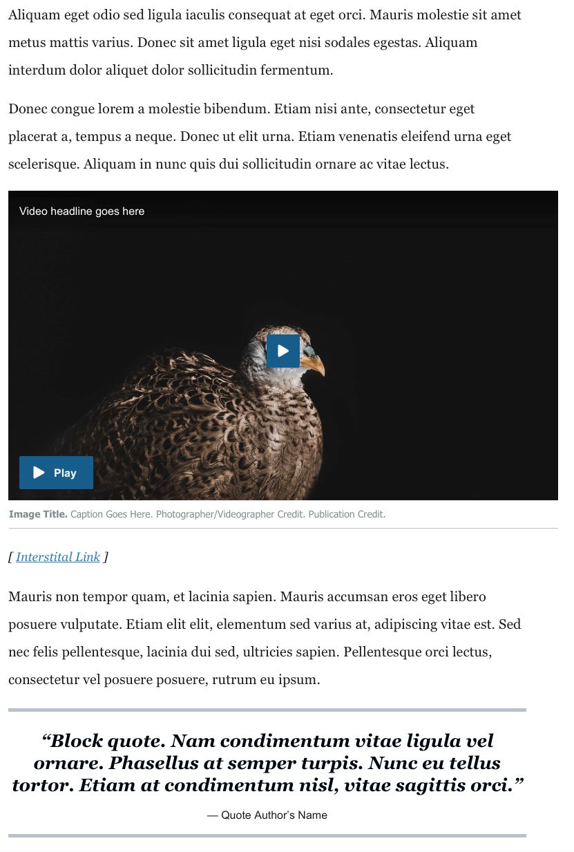
Text, headers, lists, interstitial links, corrections, pull quotes, blockquotes, oEmbeds, images, Arc videos, galleries, tables, dividers
Support for inline ads
PageBuilder users can put ad blocks into the Article Body chain, and specify which number paragraph they should follow (for example, can be configured to place an ad after the 3rd and 8th paragraphs)
How to place ads inline within the Article content
1) Insert Ads:
Place your ad blocks inside the Article Body – Arc Block chain
2) Determine the ads’ placements throughout the article:
In the Article Body – Arc Block under Chain Configurations --> Inline ads --> Ad placements set the key value pairs:
The first field references the position of an ad you’ve inserted into the chain
The second field designates the paragraph number that this ad should follow in the article body
For example, entering 1 and 2 means that the first ad in the article body chain is placed after the second paragraph in the article. Entering 2 and 5 means the second ad in the article body chain is placed after the fifth paragraph in the article.
Gallery – Arc Block
 |
Key features
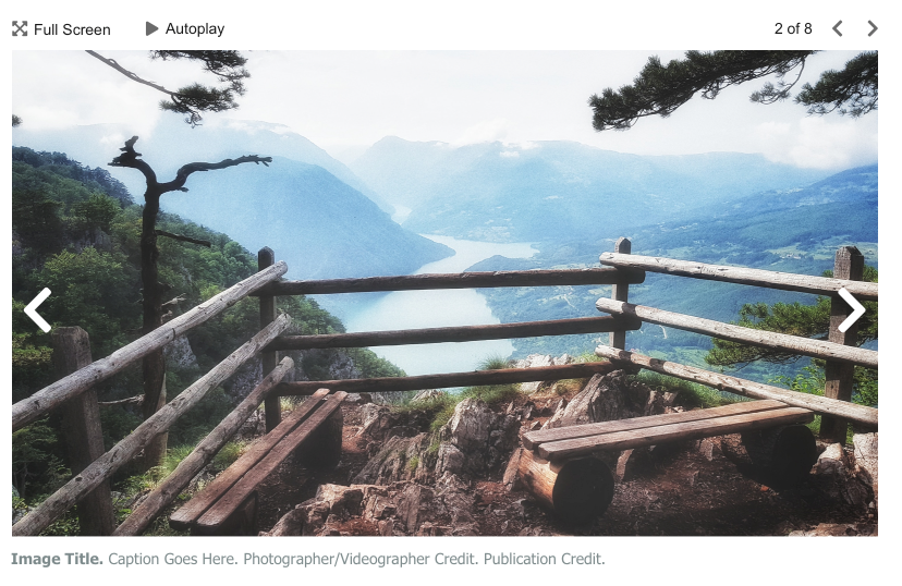
Renders images from an Arc Photo Center gallery
Includes image title, caption, and credit information
Lightbox (full screen) mode
Optional: Customers can optionally enable an interstitial ad to appear after every X images.
How to configure the interstitial ad
If desired, customers can configure an ad to appear as the user advances through images in the gallery. To do so, use the Theme Settings Configurations for Gallery Cube Clicks.
Note
The ad that displays is the Gallery Cube ad type from the Google Ad - Arc Block. There is no option to supply an alternative ad. If your organization requires a customized interstitial ad in the gallery, you will need to eject from the Gallery – Arc Block and make customizations as necessary.
Video Center Player – Arc Block
 |
Key features
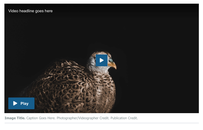
Renders videos using the Arc Video Center player
Videos can optionally be set to Autoplay
Videos can optionally set to Playthrough
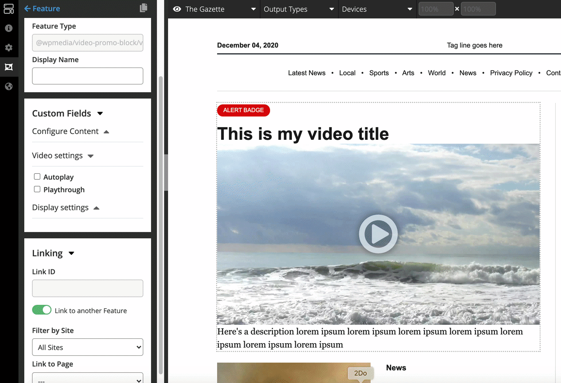
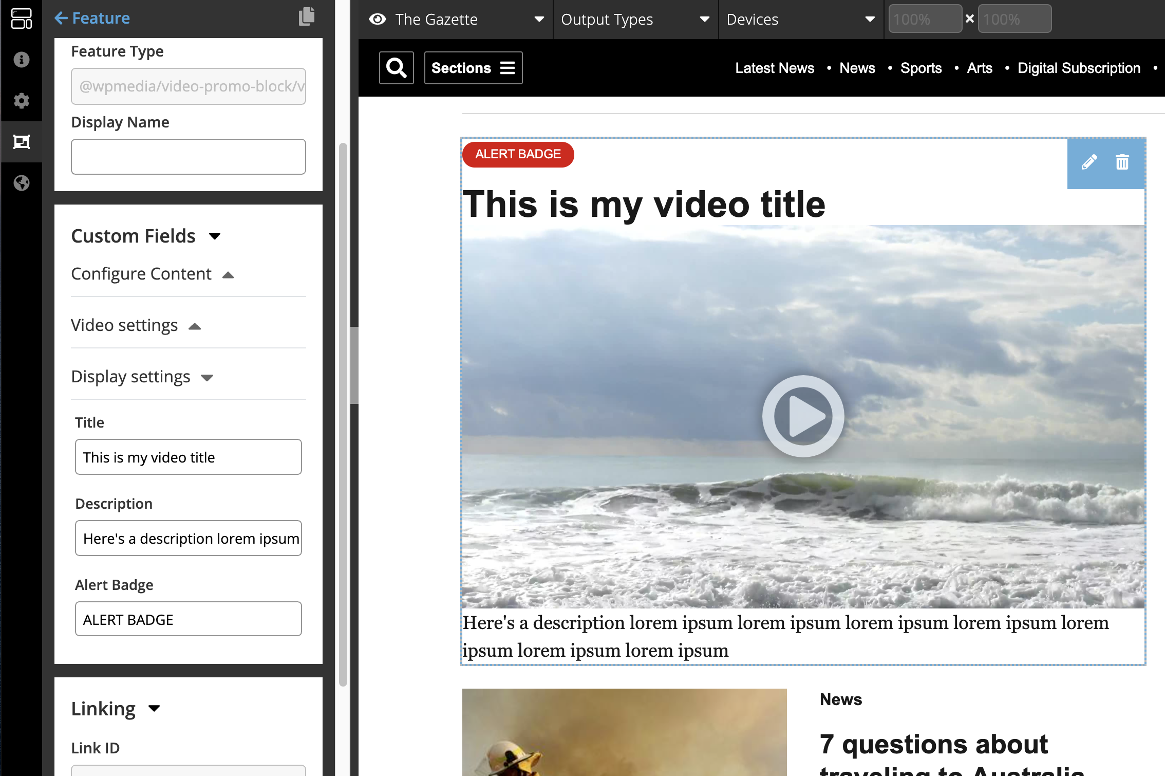
Custom title, description and alert badge can optionally be added
Can render custom pre-roll ads through custom configuration of video script
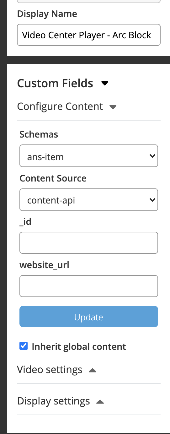
Custom Fields
Name | Type | What it does |
|---|---|---|
Configure Content | ||
Schema/Content Source | Content Config | Allows you to configure the content for this block. Select ans-item for the Schema and content-api for the Content Source. Enter a website URL or an ID for a video in the respective field. |
Inherit Global Content | Checkbox | If true, the page’s Global Content will be used to populate the video center player block. Intended primarily for use on the video template. |
Video Settings | ||
Autoplay | Checkbox | If true, the video will begin autoplaying (on mute) for the reader as soon as the page loads. Many browsers block autoplaying video, especially if it has sound, so actual behavior may vary. |
Playthrough | Checkbox | If true, once the video has finished, other videos will continue playing. See How is playthrough enabled in Video Player?. |
Display settings | ||
Title | Text | The text typed in this field will appear above the video player. |
Description | Text | The text typed in this field will render below the video player. |
Alert badge | Text | The text typed in this field will render in an alert badge above the video player. |
How to use the Video Center Player - Arc Block
1. Add the video to the page or template. On a video template, you can select the Inherit Global Content Custom Field, which will use the template’s global content (should be set to a video object). When placing a video elsewhere on the site (for example, on the homepage), you can select the content-api Content Source and enter a website URL or ANS ID for the video.
 |
2. Once content is populating the block, additional custom fields described above can optionally be set, depending on the desired behavior:
Autoplay
If autoplay is selected, the video will begin automatically playing on mute as soon as the reader loads the page.
 |
Playthrough
If Playthrough is selected, then once the selected video finishes playing, additional videos will continue playing within the same spot. See Video Playthrough docs for more details.
 |
Title, Description, Alert badge
The text entered in these Custom Fields will appear with the video, as pictured here:
 |
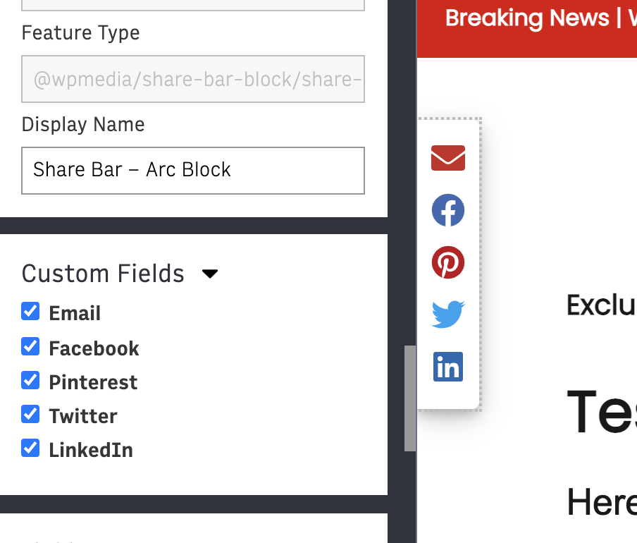
Share Bar – Arc Block
 |
Key features
Sticks to the left side of the page on Desktop breakpoint on article templates. (The share bar does not display on Tablet or Mobile breakpoints, since those devices have smaller screen real-estate and built-in share functionality).
Reader can click a social share button to share the content on that platform
Configurable by a Themes customer
Themes customers can configure which Social Share buttons are included, by checking the Custom Fields for the platforms you wish to include:
 |
Tags Bar – Arc Block
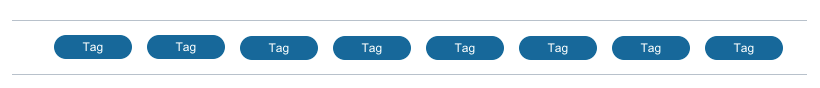 |
Key features
Displays tags associated with that content item, linked to each tag’s page
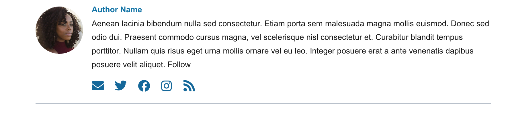
Short Author Bio – Arc Block
Key features:
Displays a bio for any Staff Author of the article
Author must have a byline and short bio present in Author Service; also optionally displays the author’s photo and social links
User can click on author’s byline to see their Author Bio page (which displays additional information about the author)
 |