Themes - Using Promo and List Blocks
Promo Blocks are used to promote content – they showcase a given headline and other elements for a content item (whether a story, video, or gallery).
These are the main building blocks for the Homepage, and are also used on Results Pages and even on Content Item Pages, in order to encourage readers to recirculate (click on another page).
Types of Promo Blocks
Promote one single story, video or gallery:
Extra Large Promo
Large Promo
Medium Promo
Small Promo
Promote any type of content manually:
Extra Large Manual Promo
Large Manual Promo
Medium Manual Promo
Small Manual Promo
Promote a feed of stories/videos/galleries (see How to Set up a Feed) with List blocks:
Top Table
Simple List
Numbered List
Results List
Card List
Elements within a Promo Item
Below is a list of the elements used to create a promo (overline, headline, description, image, byline and date), as well as the business logic for how that elements are generated.
Overline: Same as Overline Block
Headline: Same as Headline Block. URL comes from website_url (for the website being rendered)
Description: Text comes from description.basic
Promo Image: Image data comes from promo_items.basic if present, otherwise the Fallback Logo is used. URL comes from website_url (for the website being rendered)
Byline: Same as Byline Block
Date: Same as Date Block
Display sizes
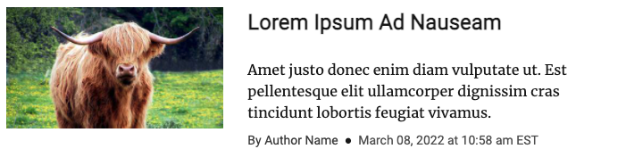
Small Promo Item
 |
Can display headline, image, and bottom border
Image displays right of headline by default, at a 3:2 aspect ratio. Image takes up 1/3 of available width.
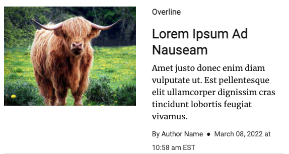
Medium Promo Item
 |
Can display headline, description, author name, date, and bottom border
Image displays left of headline by default, at a 16:9 aspect ratio. Image takes up 1/3 of available width.
Large Promo Item
 |
Can display overline, headline, description, author name, date, and bottom border
Image displays left of headline by default, at a 4:3 aspect ratio. Image takes up 1/2 of available width.
XL Promo Item
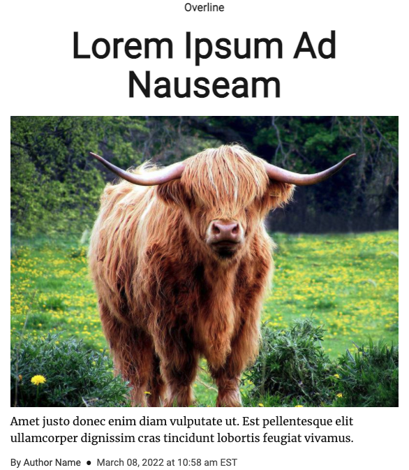 |
Can display overline, headline, description, author name, date, and bottom border
Image displays above headline by default, at a 4:3 aspect ratio. Image takes full available width.
Overline and headline are centered
List Blocks
List Blocks are Themes Blocks that allow you to display a list of stories in a column. They can be displayed with or without numbers (Simple List or Numbered List), and there is even an option to display a list with a larger card with more detail for the first story (Card List).
Simple List
Simple List is a Theme block that displays a list of stories in a column without numbers.
Setup
In Configure Content select ans-feed from the schema dropdown. Select story-feed-query from the Content Source dropdown. Enter type:story in the Query field. Set the size and offset (a good starting place would be 3 and 0, respectively). Click the update button.
You can customize the display for the Simple List by expanding the Show Promo Elements accordion.
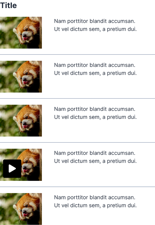
Can display headline and/or image.
Image displays left of headline by default, at a 3:2 aspect ratio. Image takes up 1/3 of available width.
Numbered List
Numbered List is a Theme block that displays a list of stories in a column with numbers.
Setup
In Configure Content select ans-feed from the schema dropdown. Select story-feed-query from the Content Source dropdown. Enter type:story in the Query field. Set the size and offset (a good starting place would be 3 and 0, respectively). Click the update button.
You can customize the display for the Numbered List by expanding the Show Promo Elements accordion.
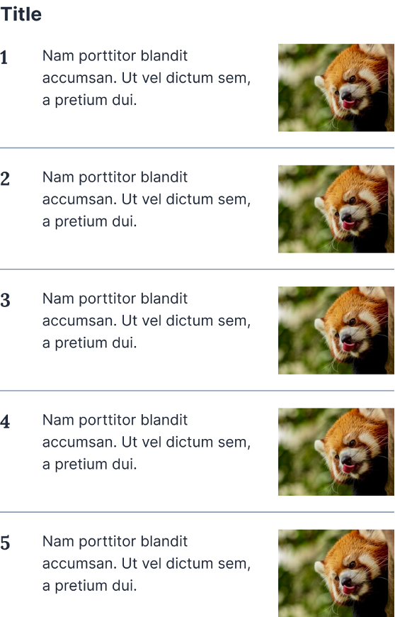 |
Can display headline and/or image.
Image displays right of headline by default, at a 3:2 aspect ratio. Image takes up 1/3 of available width.
Card List
Card List is a Themes Block that allow you to display a list of stories in a column with a larger card for the first story on top.
Setup
In Configure Content select ans-feed from the schema dropdown. Select story-feed-query from the Content Source dropdown. Enter type:story in the Query field. Set the size and offset (a good starting place would be 3 and 0, respectively). You can optionally set the Offset Override and Amount of Items to Display if needed for your page configuration. Click the update button.
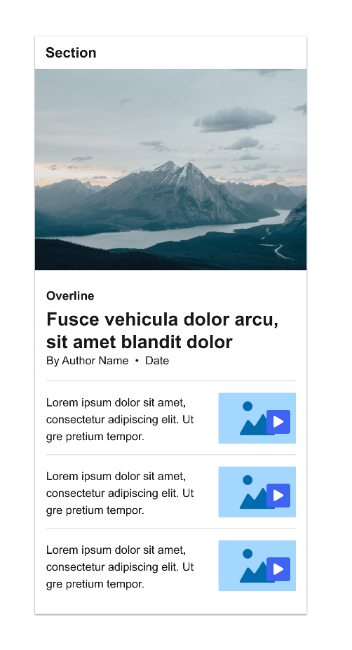 |
Top story displays overline, headline, byline and date.
Subsequent stories display headline and image.
Image displays right of headline by default, at a 3:2 aspect ratio. Image takes up 1/3 of available width.
Top Table List
The Top Table List is a Themes Block which allows you to display multiple stories in various sizes, from largest to smallest. The larger sizes will display a number of details, while the smallest size will only display the image and title.
Setup
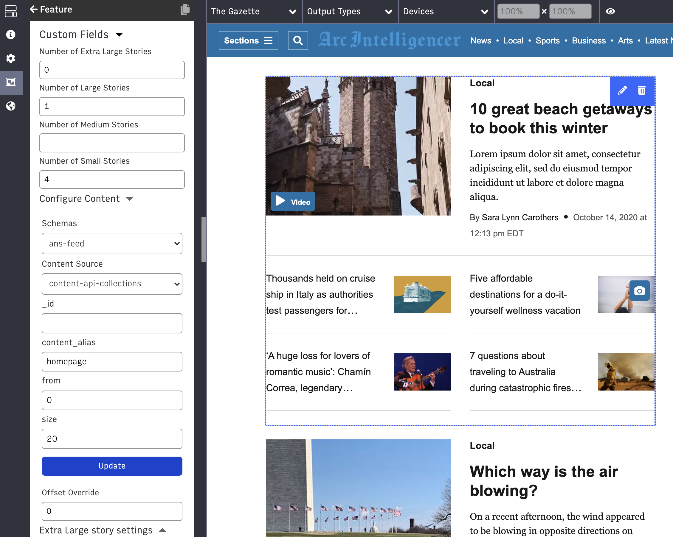
Set the number of stories to be displayed in each size in the Custom Fields.
In Configure Content select ans-feed from the schema dropdown. Select story-feed-query from the Content Source dropdown. Enter type:story in the Query field. Set the size and offset (a good starting place would be 10 and 0, respectively). You can optionally set the Offset Override if needed for your page configuration. Click the update button.
You can customize the display for each story size by expanding its accordion. If you are not seeing all of the information that you expect to be displayed (author, description, etc.), you’ll need to set those items in Composer for each story.
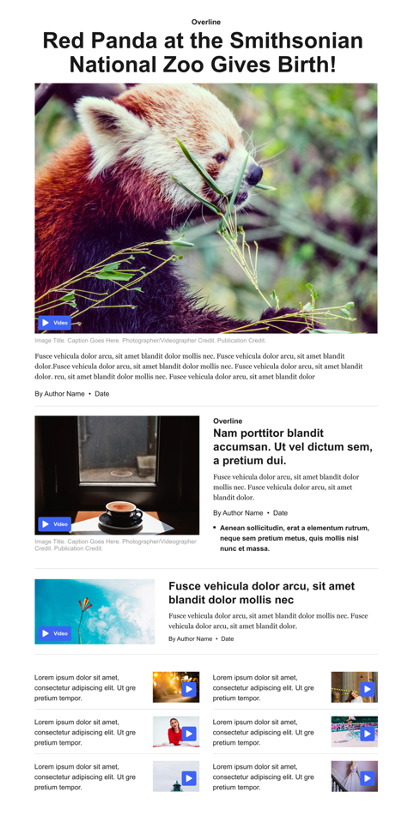 |
Extra Large and Large stories can display overline, headline, image, description, byline, date and bottom border.
Medium stories can display headline, image, description, byline, and date.
Small stories can display headline and image.
Extra Large image displays below headline by default, at a 4:3 aspect ratio. Image takes up available width.
Large image displays left of headline by default, at a 4:3 aspect ratio. Image takes up 1/2 of available width.
Medium mage displays left of headline by default, at a 16:9 aspect ratio. Image takes up 1/3 of available width.
Small image displays right of headline by default, at a 3:2 aspect ratio. Image takes up 1/3 of available width.
Offset Override for Card List and Top Table List
If your organization uses multiple Top Table List or Card List Blocks on a prominent page, such as your homepage, to show content in a certain Collection, you might notice that stories can sometimes be duplicated in different blocks. This can happen if a new story is added to the Collection, because each distinct content request is cached separately. See Caching at Arc XP. If a cache expires for one request but not another, then sometimes a story can be seen in two requests at the same time (until the latter request’s cache also expires).
To avoid duplicates when using the same Collection, use a new Custom Field called Offset Override. To do so, ensure that each Top Table List and or Card List is using the same content request, and then control the offset within the Offset Override field.
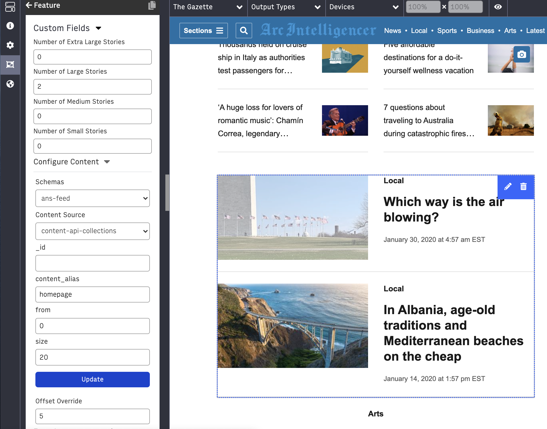
For example, this first Top Table List block on a page is requesting the following content:
content_alias: homepage
from: 0
size: 20
However, only the first 5 stories are actually displayed – 1 large story and 4 small stories.
 |
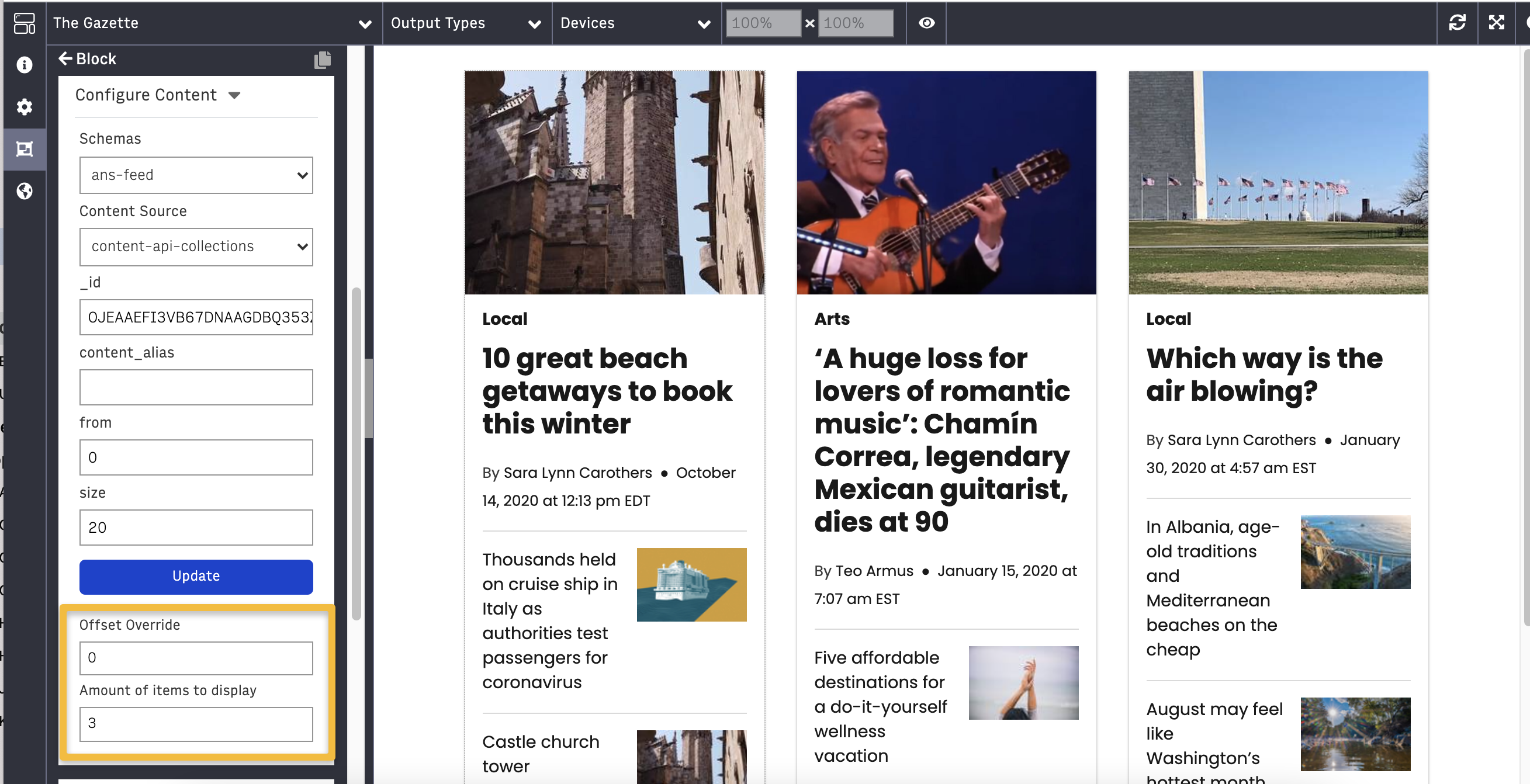
In the next Top Table List, the exact same content request is used:
content_alias: homepage
from: 0
size: 20
However, the Offset Override is now set to 5. This means that we’ll skip rendering the first 5 stories (since they were shown in the first Top Table List on the page, above).
 |
This can be continued in additional Top Table List blocks. Since the content request is the same, the cache will expire at the exact same time for all of these blocks, meaning that duplicates won’t be seen.
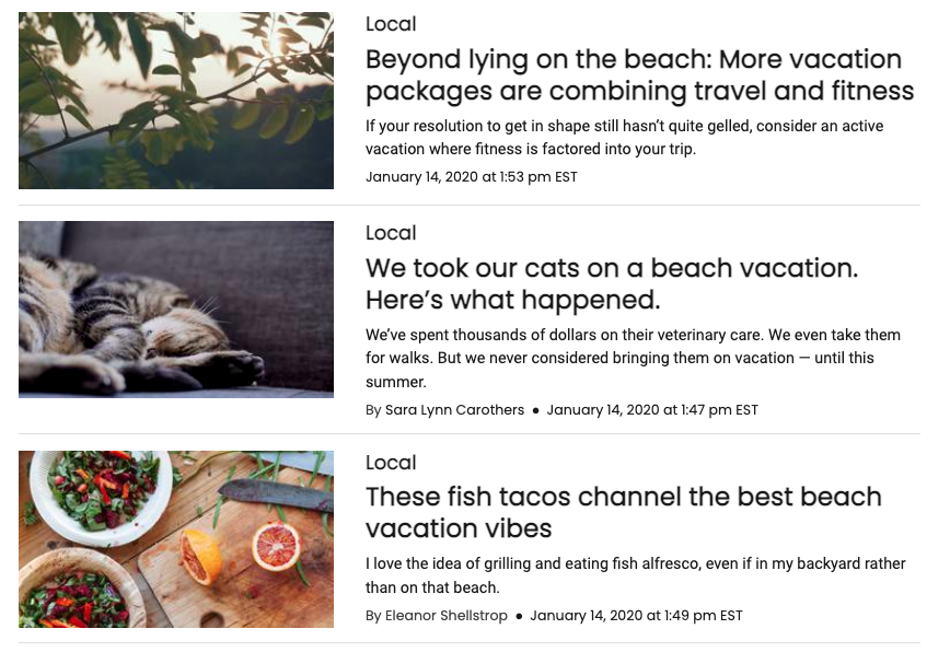
Below is an example of using the Offset Override on the Card List. In the example, three Card List blocks are shown in a Triple Chain. Each has an identical Content Configuration (same Content Source with “From: 0″ and “Size: 20″). The left column has an Offset Override of 0, middle column is set to 3, and right column set to 6. Each is set to display 3 items per list. The Offset Override and Amount of Items to Display fields can be used to control which selection displays for each block.
 |
Results List
Results List is a Themes Block that displays a list of results from a query.
Setup
In Configure Content, select ans-feed from the Schemas dropdown, story-feed-query from the Content Source dropdown, enter type:story in the Query field, and then enter the size (number of results to show) and offset (starting number from the first result) in their respective fields.
Note
If you want to see the most recent results you can leave the offset field blank or just enter 0.
This default setup will display a list of the most recent stories, but you can change the Content Source and Query to display whatever you need.
 |
|
Can display overline, headline, image, description, byline, and date.
Image displays left of headline at a 3:2 aspect ratio, by default. Image takes up 1/3 of available width. You may also configure the image aspect ratio to 16:9 or 4:3.