Navigation Blocks
Navigation blocks are typically placed on all pages, to assist readers with navigating the website.
Navigation - Arc Chain
Key features:
Section Menu opens on left side
Section Menu can display up to 2 levels of hierarchy
Customers can configure placement of components within the Navigation Chain across desktop and mobile
Recommendation and best practice is to link each instance of this chain back to a fragment page, so that you can make changes to it in one place and have those appear everywhere on the website. See Themes - Fragment Page + Linking Guidance for Themes for more details.
Custom fields
Name | Type | What it does |
|---|---|---|
Aria-label | Text | The label is provided to assistive technologies to provide it with a unique name for the header nav landmark - defaults to Sections Menu if left blank |
Links Bar - Aria-label | Text | The label is provided to assistive technologies to provide it with a unique name for the header links nav landmark - defaults to Top Links if left blank |
Configure content | ||
Sections Menu hierarchy | Text | The name of the Site Service hierarchy you wish to display when a user opens the Sections button. Can display up to 2 levels of hierarchy. |
Horizontal Links hierarchy | Text | The name of the Site Service hierarchy you wish to display as horizontal links across the top bar of the navigation. Can display only 1 level of hierarchy. NoteThe horizontal links can only display if the Logo alignment is set to left. |
Logo | ||
Logo alignment | Select | Select whether the logo should be aligned to the center or left of the top bar of the navigation |
Starting desktop navigation bar height | Number | Select the height of the navigation bar (in px) when the user first opens a page on desktop. Must be between 56 and 200. |
Shrink navigation bar after scrolling | Number | How far should the user scroll (in px) until the navigation height shrinks back to standard size (56px) on desktop? Must be greater than the value configured for Starting desktop navigation bar height. |
Display | ||
Display dots between horizontal links | Checkbox | If checked, separator dots will display between the horizontal links in the top bar of the navigation. |
Mobile components | See documentation below | |
Desktop components | See documentation below |
Component slots in the Navigation Chain
The Navigation is created as a Chain so that other blocks can be placed within the chain. This allows you to customize the Navigation Chain with custom components. There are a total of 10 different component slots that can be configured by using the Custom Fields of the Navigation Chain.
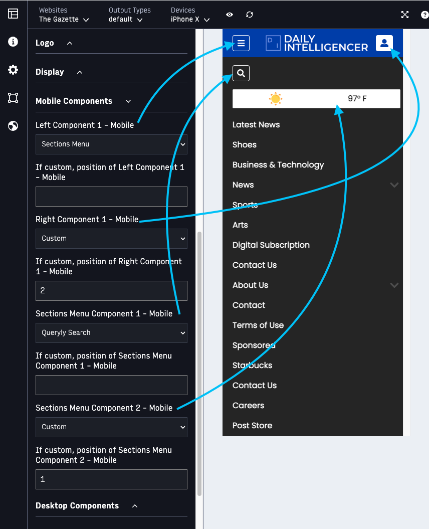
On the mobile breakpoint, there are two available component slots in the top bar of the navigation:
 |
Left Component 1 - Mobile
Right Component 1 - Mobile
If a user opens the Sections Menu, there are two additional component slots within the Sections menu on mobile:
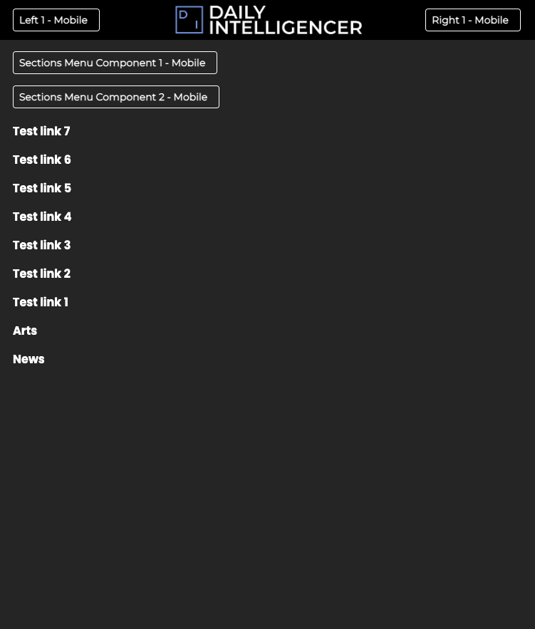 |
Sections Menu Component 1 - Mobile
Sections Menu Component 2 - Mobile
On the Desktop breakpoint, there are four available component slots in the top bar of the navigation:
 |
Left Component 1 - Desktop
Left Component 2 - Desktop
Right Component 1 - Desktop
Right Component 2 - Desktop
If a user opens the Sections Menu, there are two additional component slots within the Sections menu on desktop:
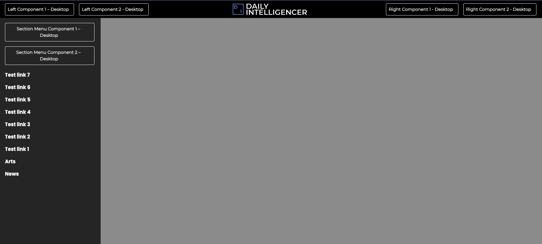 |
Sections Menu Component 1 - Desktop
Sections Menu Component 2 - Desktop
Each of the component slots listed above has a corresponding Custom Field, which allows you to choose from the following options:
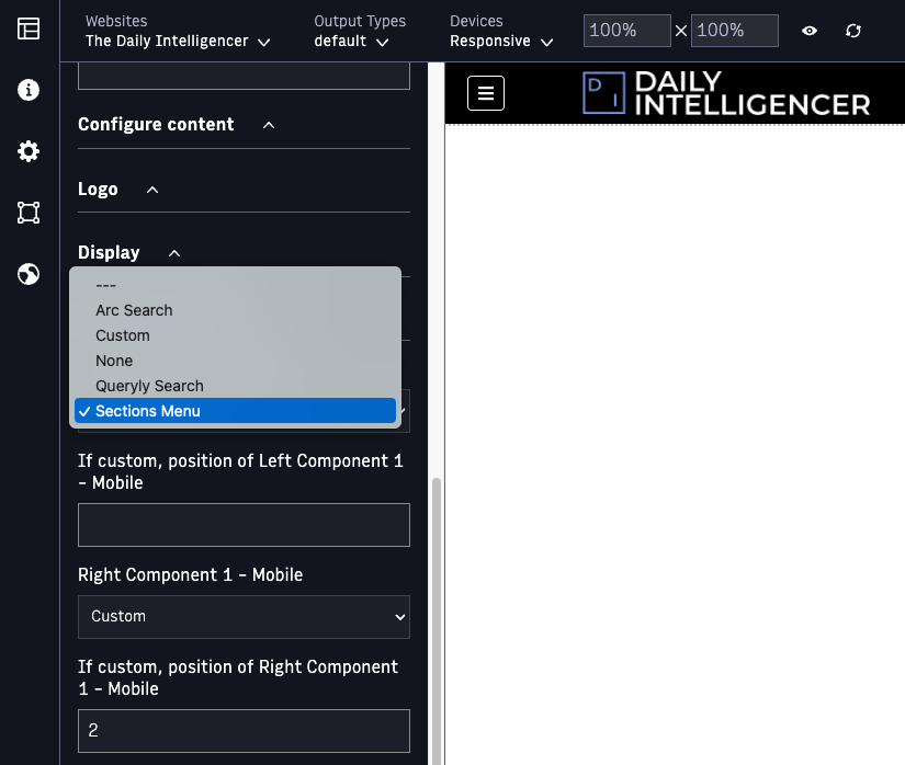 |
Arc Search // If selected, will display a search icon, which a user can click to enter search text. It can be used if Arc Site Search is contractually enabled for your organization. (Arc Site Search is not supported for new Arc customers.
Custom // If selected, a custom block can display in this slot. See further explanation below
None // If selected, nothing will display in this component slot
Queryly Search // If selected, will display a search icon, which a user can click to interact with. The organization must have a Queryly account.
Sections Menu // If selected, a hamburger icon will display, which a user can click to open the Sections Menu from the left side of the screen. The list of links that appear in the Sections Menu can be configured in Site Service.
If you select Custom, then you must 1) drag the Block you wish to appear in this space into the Navigation Chain and 2) use the corresponding field below (for example, If custom, position of Left Component 1 - Mobile) to specify its position within the chain.
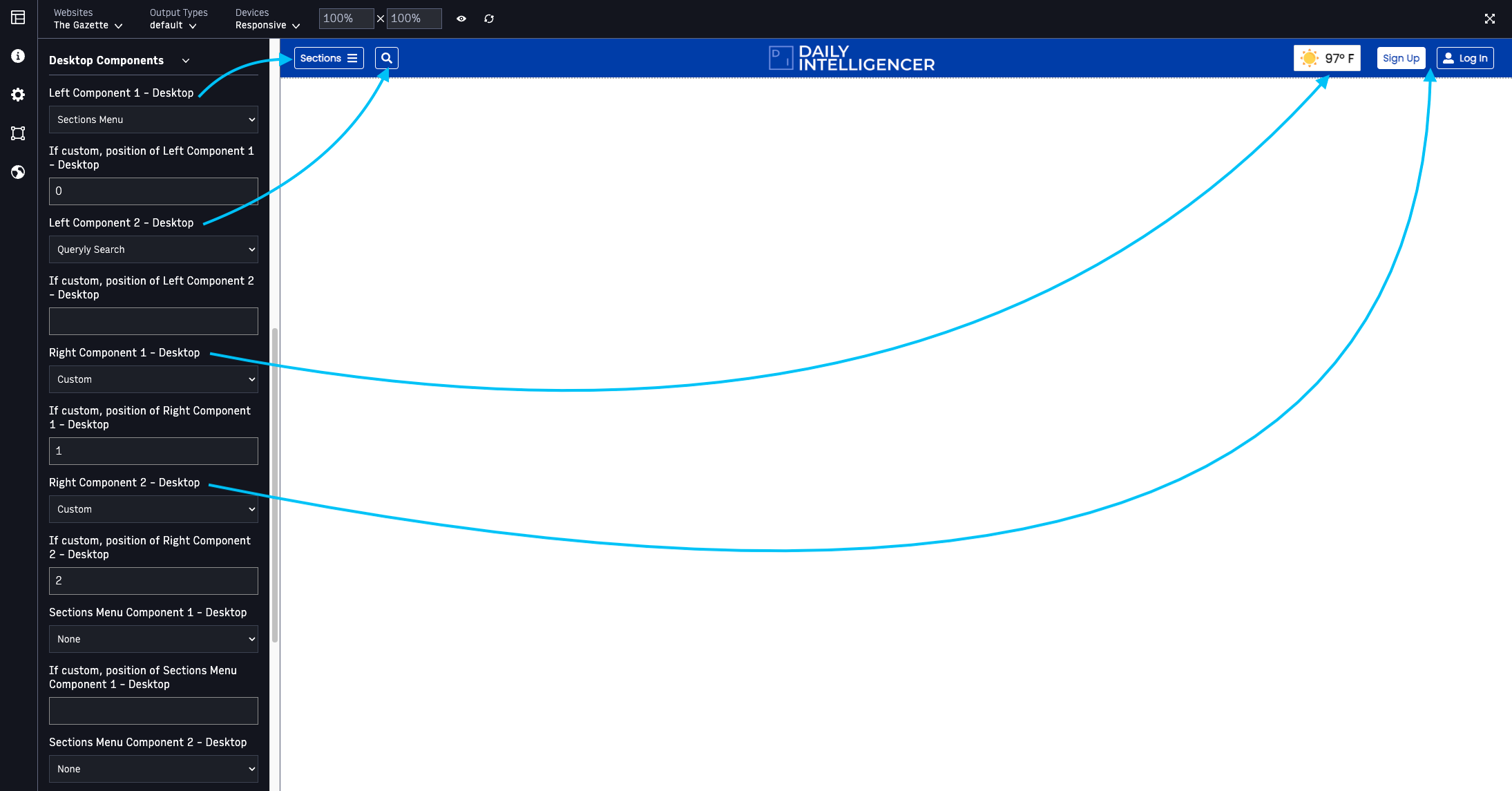
For example, imagine you have two Blocks you want to use within the Navigation Chain - a custom weather widget, and the Identity Header Account - Arc Block. Drag them both into the chain, and take note of which position each takes within the chain.
 |
When configuring your chain for Desktop breakpoints, you could choose to have the Sections Menu and the Queryly Search options display on the left side of the navigation, and have your Custom Weather Widget and the Identity Header Block display on the right side of the navigation. Note in the example below that since we want to display the blocks placed in this chain in Right Component 1 and 2, we've selected Custom and then entered the block's position within the chain - In the Right Component 1 slot, we want the weather widget to appear, so we enter position 1 (since it's the first block in the chain); in the Right Component 2 slot, we want the Identity Header Account block to appear, so we enter position 2 (since it's the second block in the chain):
 |
On mobile, however, you won't be able to fit all 4 of these components within the top bar of the navigation (there is not room on mobile viewports for this many components). So you may choose to display the most critical ones in the top bar of the navigation (for example, the Sections menu and the Identity Header Account). Then, you can place the other components (Queryly search and the Custom Weather Widget) within the Sections menu, so users can access them if they open the Sections menu. Note that since we want the Identity Header Account Block to appear in the Right Component 1 - Mobile slot, we've selected Custom, and then chose position 2, the Identity Header Block is the second block in the navigation chain. Similarly, for Sections Menu Component 2 - Mobile, we want the weather widget to display, so we've selected Custom and set the position as 1, since the weather widget is the first block in the chain:
 |
Links Bar - Arc Block
 |
Key features:
Displays a list of links horizontally on a page
Can be used to display an editorially curated list of links (like Trending Topics) or site navigation links
How to use the Links Bar - Arc Block:
1. Set up a hierarchy in Site Service (for example, links-bar) to control the links you want to appear for each website. The Links Bar - Arc Block can display 1 level of hierarchy.
2. Configure the Links Bar - Arc Block to utilize this hierarchy you created. For example:
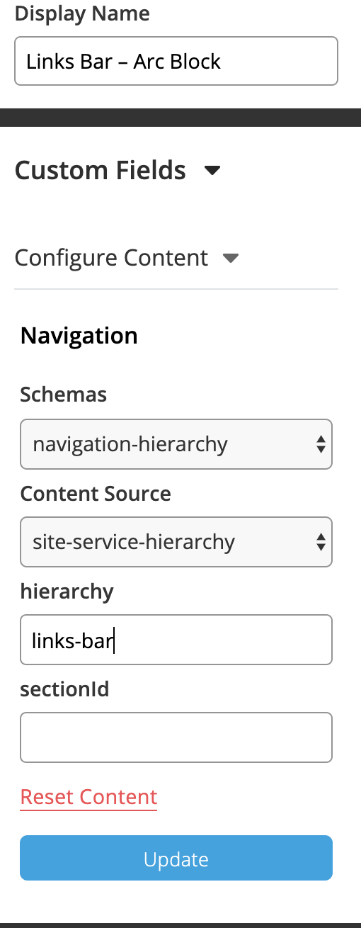 |
3. Place the Links Bar - Arc Block on all pages/templates where you want it to appear. Best practice is to link all instances of the block to a fragment page (if you are using the same hierarchy for them).
Alert Bar - Arc Block
 |
Key features:
Displays breaking news alerts across the site
Controlled by a Collection
How to use the Alert Bar - Arc Block:
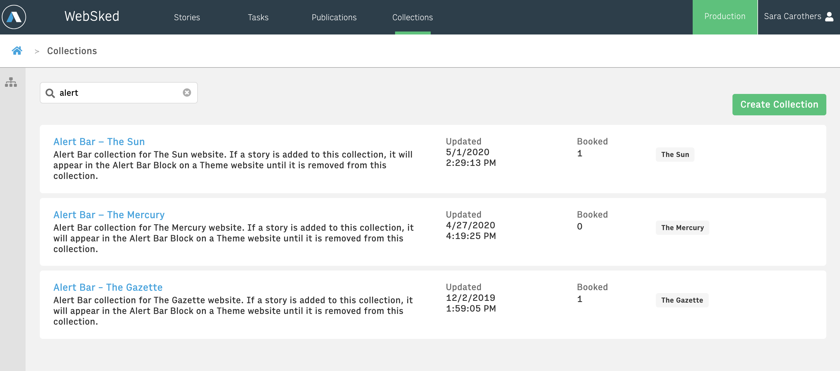
1. Set up an Alert Bar Collection for each of your websites. Example:
 |
2. Each of these Collections must have a Collection Alias of alert-bar
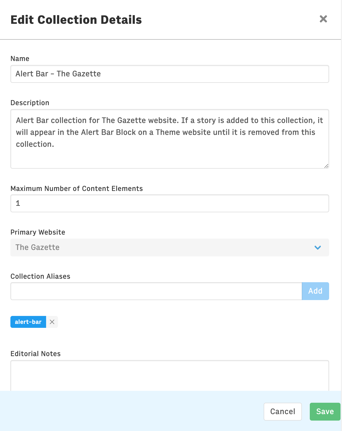 |
Suggested description, to assist editors: Alert Bar collection for [ENTER NAME] website. If a story is added to this collection, it will appear in the Alert Bar Block on the [ENTER NAME] website until it is removed from this collection.
3. Ensure that the Alert Bar - Arc Block is placed on all of the pages + templates that you want alerts to appear on.
4. When a story is added to an Alert Bar collection, that story will automatically be featured in the alert bar for that website. It will display the story's headline and link to its URL.
Note: You have the option to override the headline that appears through the Edit Promo Content button in Collections - this will change the headline text only for the Alert Bar.
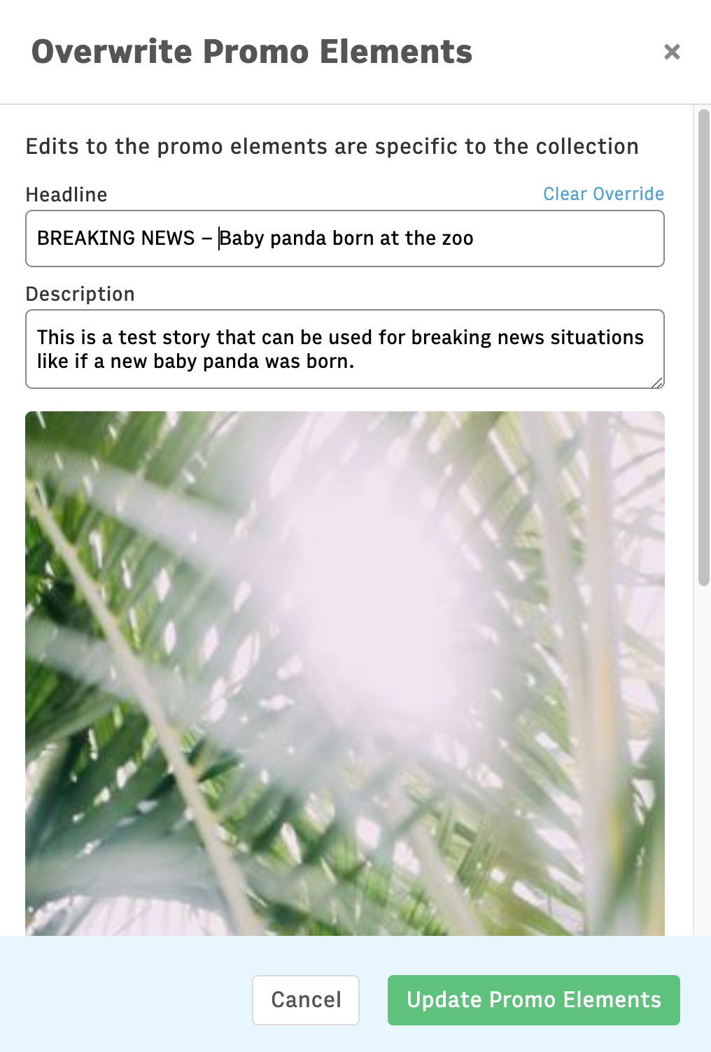 |
5. When you remove the story from the Alert Bar collection, the alert bar will no longer appear on that website.
Note: There is an approximately up to 2 minute cache on the Alert Bar, from when you republish the collection to when you see it on the website.
Additionally, if an individual reader dismisses the alert (by pressing the X button), they will no longer see that particular alert (for two days - if they alert is still present after 2 days, they will see it again). If a new alert is set (with different text), the reader will see the new alert.
Footer - Arc Block
 |
Key features:
Displays customizable list of links and/or sections at the bottom of every page on the website
How to use the Footer - Arc Block:
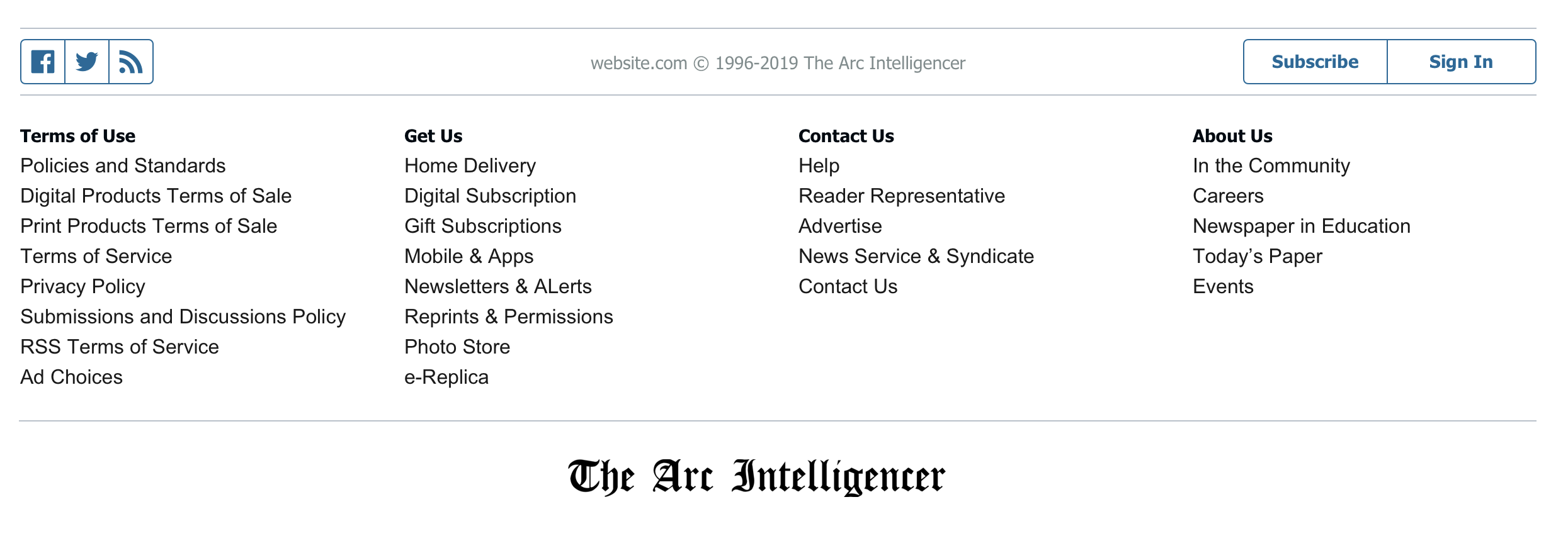
1. Set up a hierarchy in Site Service (for example, footer) to control the links you want to appear for each website. The Footer - Arc Block can display two levels of hierarchy - the non-clickable title and the links or sections below each title. In the screenshot above, Terms of Use, Get Us, Contact Us and About Us are each first-level titles and are not able to be clicked on, and the links below these are second-level links and sections.
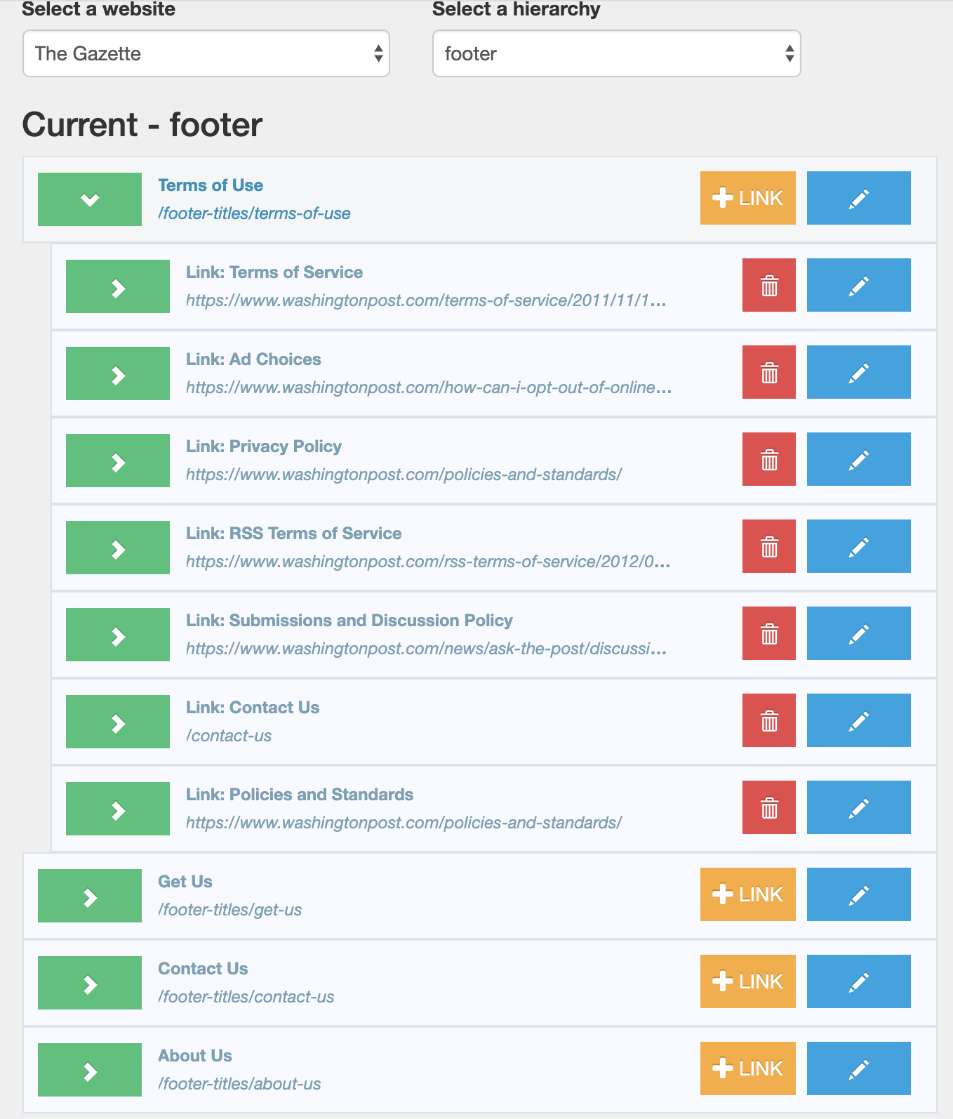
Site Service requires that any parent of child items must be a section object, not a link. For this reason, you may need to create dummy sections in your website for the titles within the footer. You will then be able to drag link items or other sections below each of these titles. You can also use sections as these titles, but note they will not be clickable.
 |
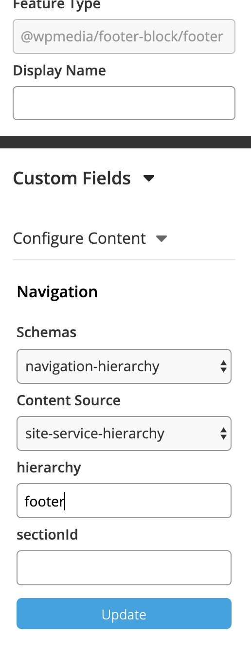
2. Configure the Footer - Arc Block to utilize your created hierarchy. For example:
 |
3. Place the Footer - Arc Block on all pages/templates where you want it to appear. Best practice is to link all instances of the block to a fragment page (if you are using the same hierarchy for them).