How to Use Drop Caps in Composer
Drop caps add visual emphasis to the beginning of a paragraph. Composer users can apply drop caps as a property to paragraph elements.
Enabling or Disabling Drop Caps
Use these steps to enable drop caps for your organization.
Click the Settings page.
In the Content elements section click the cogwheel for the Paragraph element. The Dropcaps window opens.
Select the Enable dropcaps feature (icon) in the toolbar for selected text check box.
Click Close.
Because development work is required to render drop caps on the website and any apps, we recommend not enabling drop caps in your production environment until the development work is finished so that your Composer users do not unintentionally think that drop caps are currently available on your websites.
Adding and Removing Drop Caps to a Paragraph
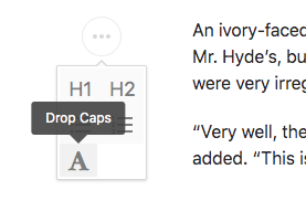
Drop caps are applied to the whole paragraph element, as opposed to the user selecting the first character or word. Therefore, to apply drop caps, click into the paragraph you want to apply drop caps to, then click one of the drop caps buttons. Two drop caps buttons appear only when a single paragraph is selected: a large A in the top toolbar and again in the small left-side tool bar.
 |
The first character in that paragraph is enlarged in the Composer UI as a cue that drop caps has been successfully applied.
To remove drop caps from a paragraph, click into the paragraph and on a drop caps button again.
Note
You can enable drop caps on any number of paragraphs in a story.
Drop caps can be combined with other text formatting such as bold and italics.
Technical Details
In the ANS definition, drop caps are available only for paragraph elements. Applying drop caps to other content elements is not supported.
Also, drop caps are applied to the whole paragraph element, as opposed to the user selecting the first character or word. As a cue within the Composer UI that drop caps has been applied to a paragraph, Composer enlarges the first character in the paragraph.
Downstream development, such as in PageBuilder, are required to render drop caps. It is up to your organization how you want to render those drop caps to readers. For example, your website could interpret the drop caps property on a paragraph as a sign to render the first character — or the first word, if that is your organization’s styling. If your organization uses drop caps to emphasize the first word as opposed to just the first character, we recommend you relay to your Composer users that the Composer UI will enlarge the first character only to indicate drop caps is applied to that story, so that they don’t wonder why the Composer UI is showing just the first character enlarged.
Below are examples of how drop caps will appear in the ANS of a story:
Example 1: Paragraph with drop caps applied and no other text formatting
content_elements[0].block_properties.dropcap = “letter"
{
  "_id":"DFTZW4KFSZBWHHKY36CVJM7CFM",
  "type":"story",
  "version":"0.10.2",
  "content_elements":[
    {
      "_id":"VXJI27LUYZDRPN5LXHPA2UD6F4",
      "type":"text",
      "additional_properties":{
        "comments":[],
        "inline_comments":[]
      },
      "block_properties":{
        "dropcap":"letter"
      },
      "content":"hello"
    }
  ],
  ...
}
Example 2: Paragraph with drop caps applied and the first word italicized
{
  "_id":"DFTZW4KFSZBWHHKY36CVJM7CFM",
  "type":"story",
  "version":"0.10.2",
  "content_elements":[
    {
      "_id":"VS7CK4QQBJGTTJYPJ3FROH2KEA",
      "type":"text",
      "additional_properties":{
        "comments":[],
        "inline_comments":[]
      },
      "block_properties":{
        "dropcap":"letter"
      },
      "content":"<i>h</i><i>ello</i> there"
    }
  ],
  ...
}