How to Add Block Experience
Add Block
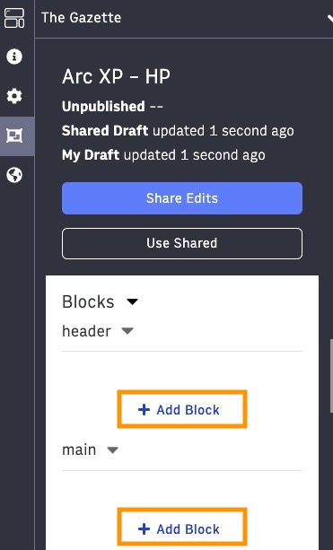
In the Curate Workspace, the Add block button in the blocks navigator on the left has a + icon.
 |
It is easy to visually distinguish between the blocks and chains and the Add block button in each Layout zone. As you hover on the Add block button, it is highlighted. The improved Add block experience is available upon clicking the Add block button and other block and chain interactions as described in the sections below.
How to add a block?
Option 1:
Click Add Block. You see a slide out next to the blocks navigator instead of the modal.
Other options, such as Add block below, Add block of a given type, Clone, Add Block to Chain (applicable only to a Chain), etcetera, are available through the ellipsis icon  on the Block or Chain themselves in the Blocks navigator.
Option 2:
You can also add a block directly in the Editor Preview. Hover on a block, and you see the icon to Add a block above or below the current block. For the block at the top, you can add a block below it, and for the block at the bottom, you only see the option to add a block above it. When you click the plus icon  , you are presented with the same panel experience described above.
Know the Add Block panel
There are four tabs in the panel to add a block or a chain.
The functionality remains the same, except the “Other Pages” tab is renamed as Linking to make it clearer that through this section, you can find linkable Blocks or Chains from other Pages or Templates.
Blocks - library of Blocks from your Feature bundle
Chains - library of Chains from your Feature bundle
Linking- linkable Blocks and Chains from other Pages and Templates
Clipboard - Blocks or Chains that are added to the Clipboard by you or the other collaborators of the Page or Template
Toggle Views
Within the Add Blocks panel, you can choose between a List View and Grid View to see your library of blocks. Each view displays an icon that visually correlates to the block (read the Adding Icons to Your Blocks section below), and you can toggle between views by clicking on the corresponding icon.
Tooltips
If the tooltips are turned on, you can hover over each individual icon in the Add block panel to learn what they are. You can turn on the help tooltips by clicking on the “?” icon on the toolbar at the top.
Editor Preview and other interactions
When the Add block panel is open, you can still scroll the Editor Preview, but if you click on any block actions, such as the pencil icon or the trash icon on the features, the Add block panel will be closed. Similarly, if you click on other Workspaces, the panel will be closed.
However, you can update the global content, perform actions such as Share edits or Use Shared, interact with options such as websites, devices, and output types drop-downs, or refresh the Editor Preview from the toolbar at the top without closing the Add block panel.
Block actions
Block actions such as Change Type or Add Block Below will also open the updated user interface.
Chain actions
Chain actions such as Change Type and Add Block to Chain will open the updated user interface.
For Add Block to Chain action on a chain and Add Block Below on a chained block, the panel will display only three tabs - Blocks, Linking, and Clipboard. Linking will allow you to add linkable Blocks but not chains. If you have any chains in the Clipboard, they won’t be available to add under a Chain.
Clipboard
As you add blocks or chains to the clipboard, you can view and interact with it and add or remove any clipboard items.
How to add icons to your blocks and chains
Work with your developers to select icons for your blocks and chains from the Block Icon Library (which can be found under Developer Tools) and update the configurations.
To add icons to your blocks and chains, the Fusion Feature API and Chain API have been updated to include a new property for each:
icon is used to enhance the curation experience for blocks and chains
Updates for Feature developers
PageBuilder Editor does not support custom icon libraries. Supported icons can be accessed from the Block Icon Library (which can be found under Developer Tools).
For more details on implementation, refer to the updated API documentation for Feature API and Chain API.
Documentation
Details on the Fusion Feature API and Chain API.