PageBuilder Editor: Plugins
Plugins offer the ability for block developers to add a specialized user interface for setting block or custom field specific values. Plugins can help editors set complex values when the default behavior isn’t enough.
PageBuilder Editor offers support for two types of plugins:
Custom field plugins - Through plugins at custom field level, you can provide a custom user interface and better control the information that is supplied to the block. Some examples of custom field plugins could include a color picker for selecting hexadecimal color values, a WYSIWYG editor for creating HTML snippets, a date picker, or a calculator.
Block and chain plugins - Block/chain plugins give block developers a lot of power to provide more advanced block/chain behavior to support complex custom needs with the flexibility to control the user experience through custom interface. Editors can directly interact with a block in the Editor Preview. For chains, editors can access the plugin under the overflow menu through Open Plugin. Some possible applications of block/chain plugins could be searching for content, building queries, using pre-configured presets.
This is a great way for block developers to get creative and consider any use cases that seem to fit the Plugins framework to extend custom fields and block/chain behavior and interaction beyond what is supported by the platform by default.
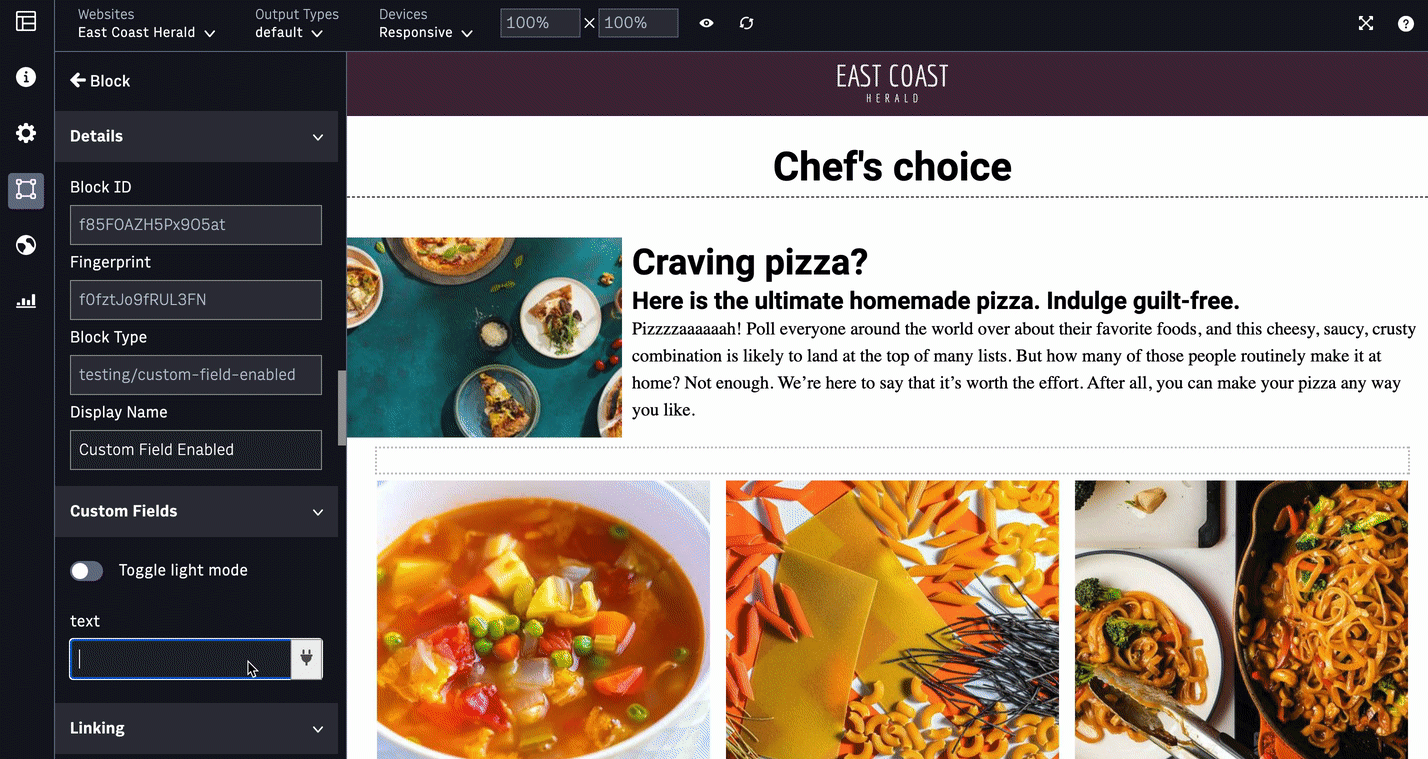
Custom field plugins
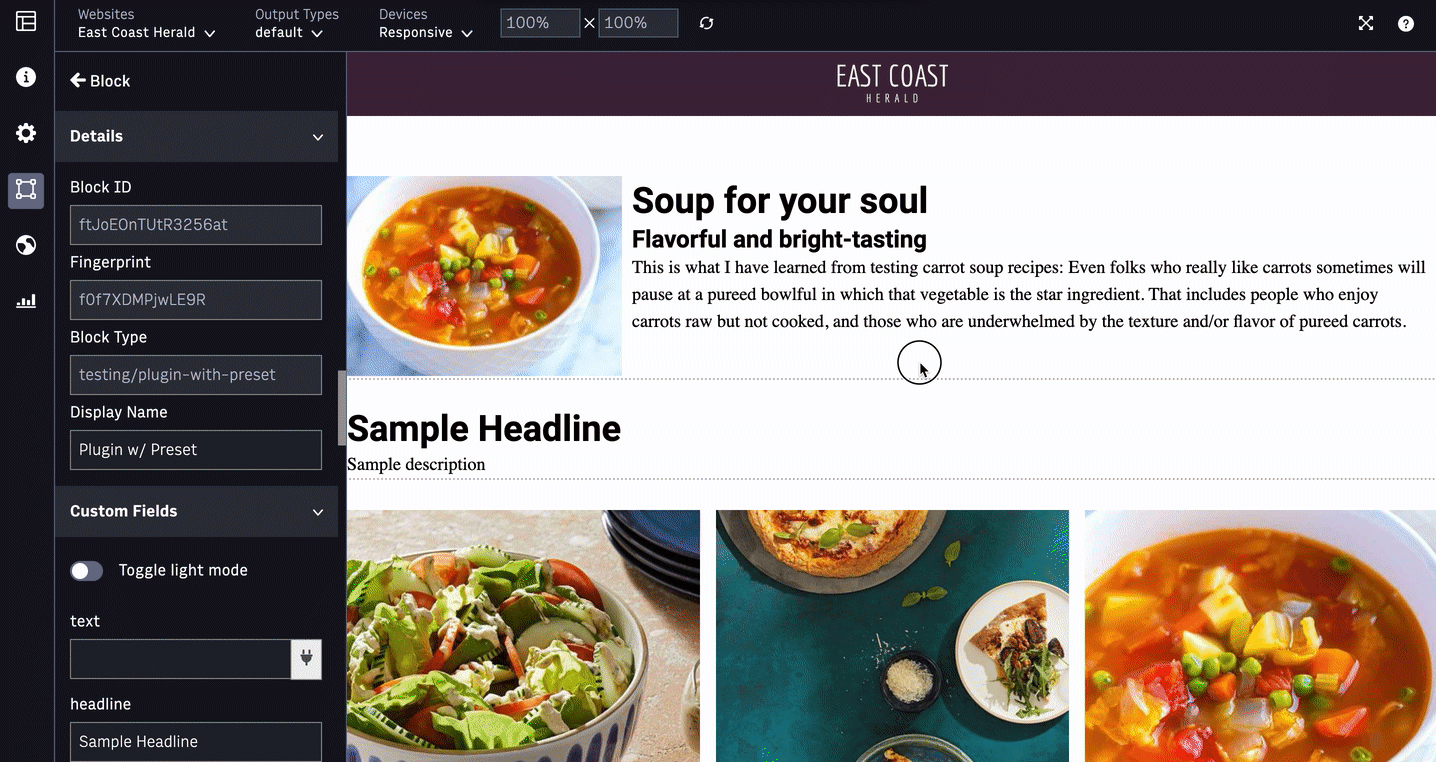
For a block/chain with a custom field setup for plugins support, when you click on the plugins icon next to the custom field in the configuration, plugins modal appears.
Custom field plugins support is available for both enabled and disabled custom fields.
 |
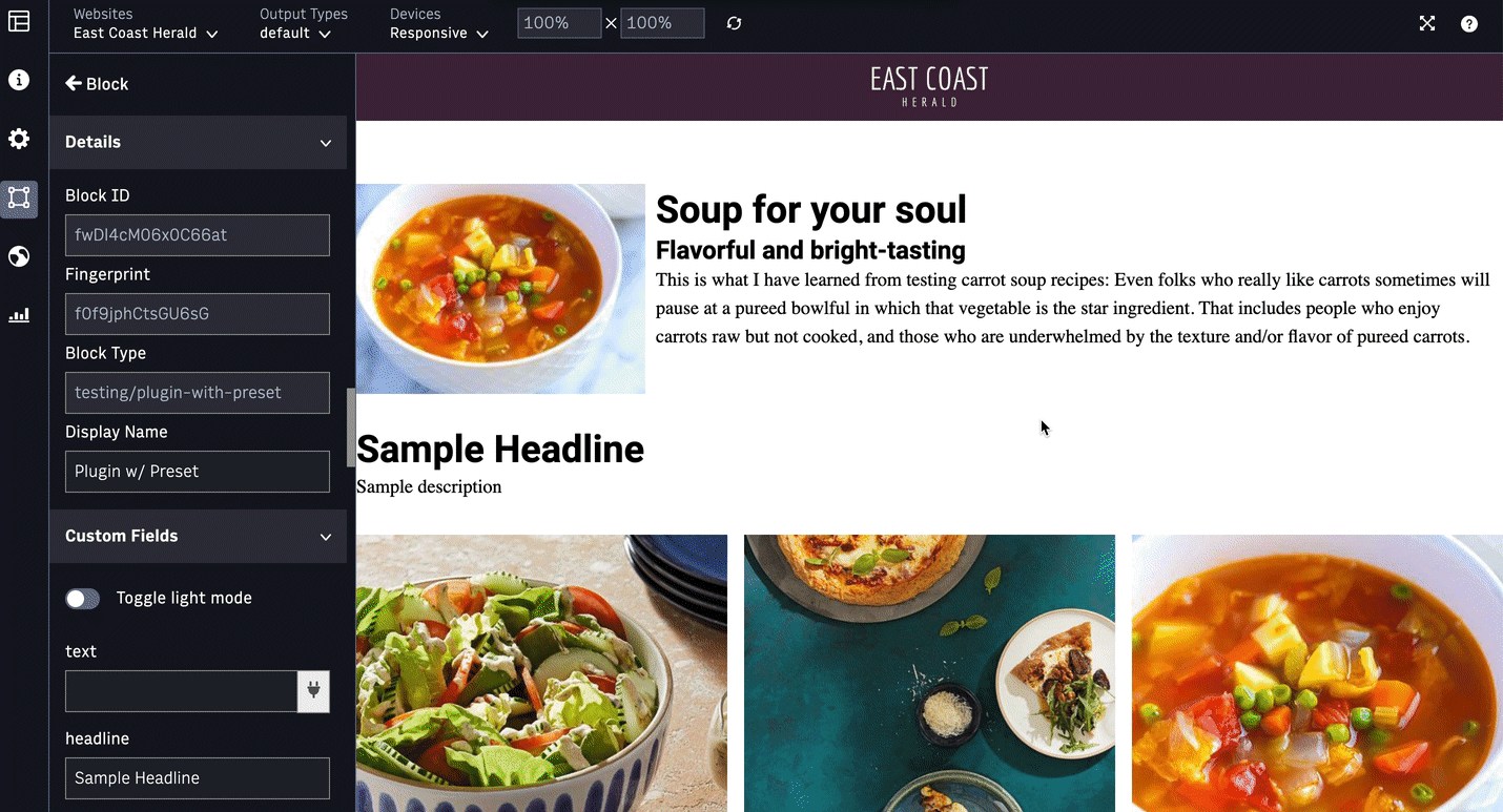
Block/Chain Plugins
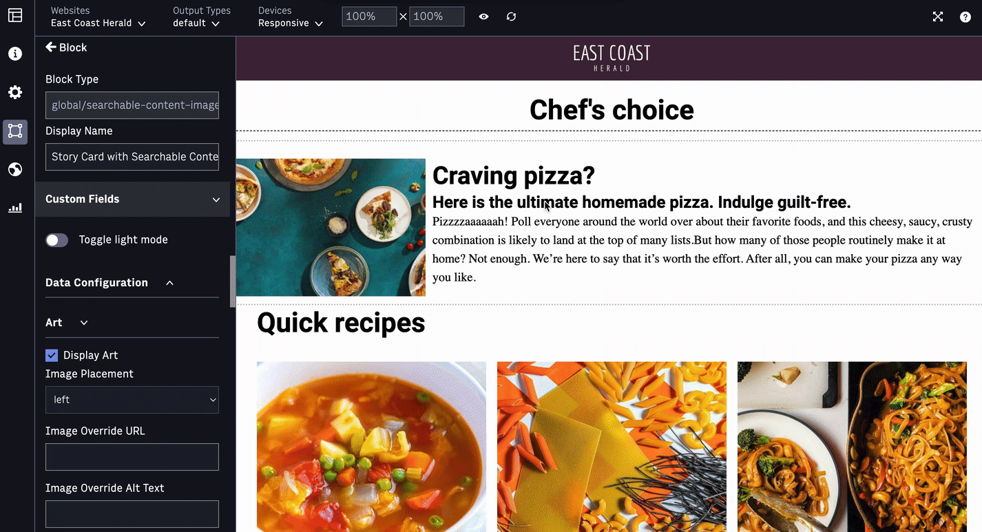
In Curate workspace, when you click on the plugins icon for a block setup with plugins support on the Editor Preview, plugins modal appears. For chains, you can access the plugins from the Open Plugin overflow menu.
Once the modal appears, configurations panel with custom fields will not be available to edit on the left. Users should interact with the plugins modal to update any relevant fields. Users cannot update the fields in the plugins modal and the custom fields in the configurations on the left at the same time.
Plugins framework supports the option to preview the changes in the Editor, Cancel or Save the updates. Plugins modal will always reflect the latest saved values for any relevant fields. So, if the user clicks Cancel, then previously saved set of values will be used.
If you click on block B in the Curate workspace, while working on plugins modal for block A, plugins modal will be closed without applying any changes and you will be out of the plugins experience.
 |
Note
Plugins modal will appear on the Editor Preview with a default height and width. Block developers will be able to update the height and width.
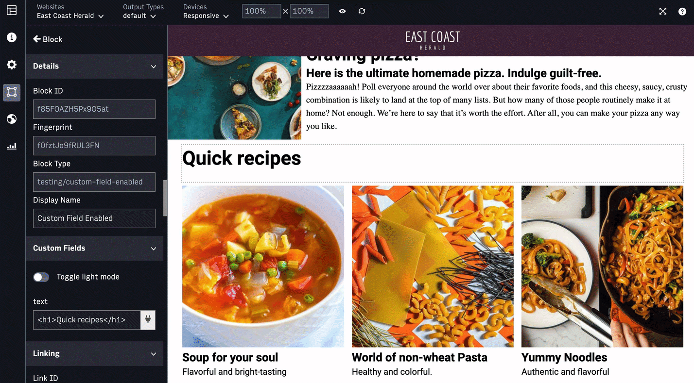
Dockability
To provide you more flexibility to position the modals (popups) such as block level plugins (another example being multi-field editables) in the Editor Preview, Editor supports docking the modal in 4 different ways: bottom-left, top-left, bottom-right, and top-right. Your last selected dock position will be stored in your local storage as your preference and will persist till you clear your cache. For example, if you dock the WYSIWYG editor (example field level plugin shown above) or Presets plugin (example block level plugin shown above) modal to bottom-right and save it, next time you edit the plugins, the modal will appear on the bottom-right.
 |
Getting Started
Plugins are implemented as HTML web pages that get included as iframes in the PageBuilder Editor. Each HTML document must include a JavaScript method named initializePlugin set on the global window object. This method is responsible for setting the initial state of the plugin UI, and will be invoked by PageBuilder Editor when a user opens the proper plugin.
Block Level Plugins
Block level plugins allow users to interact directly with a PageBuilder Block object. These plugins are powerful because users can create custom UIs that update one or several of the following block properties:
displayProperties(Object)displayName(String)customFields(Object): Unlike field level plugins, you can edit multiple custom fields at once at the block level, for example, Presets pluginlocalEdits(Object): Local content editable valuesvariants(Object)
Chain Level Plugins
Chain level plugins support the following chain properties:
displayProperties(Object)displayName(String)customFields(Object)
Multiple Plugins
Users have the ability to use single or multiple plugins at both block and chain level. In case of multiple plugins, you can choose from a menu of available plugins options.
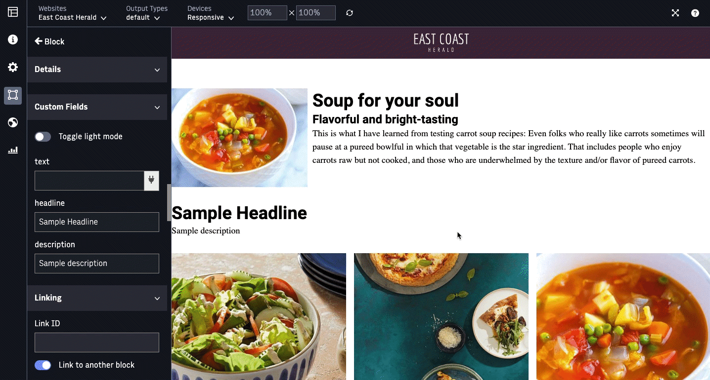 |
Presets as a Plugin
To help you get started, here is a sample use case for presets as a plugin at block level.
 |
For complex blocks/chains with several custom fields, editorial users need a quick way to set different combinations of custom fields to experience different view or behavior. In PageBuilder Classic Admin (older version of PageBuilder), this was accomplished by using “presets” which are combinations of custom fields pre-configured by block developers to provide various options to the Editors.
Through presets, different predefined combinations of custom fields are pre-populated and automatically set to present a specific block/chain behavior. For example, presets can provide a standard or magazine look and feel to a Story Card Block. With a single click, Editors can change the appearance of a block to different preset options. They can override and/or set additional custom fields, if needed.
The following code snippet implements multiple block plugins on a simple HeaderText block. PageBuilder Editor will render plugins based on the value block developers set as the `featurePlugin` option.
class HeaderText extends Component {
  render () {
    return (
        <div className="header-text">
        <h2  dangerouslySetInnerHTML={{__html: persist_param_links_in_text(this.props.customFields.title)}} />
        </div>
    )
  }
}

HeaderText.featurePlugins = ['presets', 'second-plugin']
Block developers can also set featurePlugins to a string value which would render a single block preset in the PageBuilder Editor. For example HeaderText.featurePlugins = ‘presets’.
Field Level Plugins
Field level plugin allows users to extend functionality of a specific custom field. Unlike block level plugins, block developers can only assign a single plugin per custom field. PageBuilder Editor will render plugins based on the value block developers set as the `formPlugin` option. Field level plugins are activated when a clickable plugin icon appears to the right of the custom field in PageBuilder Editor. The following code snippet implements a field level plugin (color-picker) on HeaderText’s title custom field.
class HeaderText extends Component {
  render () {
    return (
        <div className="header-text">
        <h2  dangerouslySetInnerHTML={{__html: persist_param_links_in_text(this.props.customFields.headerText)}} />
        </div>
    )
  }
}

HeaderText.propTypes = {
  customFields: PropTypes.shape({
    title: PropTypes.string
        .tag({
          name: 'Title',
          defaultValue: 'Sample Text',
          formPlugin: 'color-picker'
        })
  })
}
Initialize Plugin (function)
The initializePlugin method is required for a plugin to be able to interface with PageBuilder Editor by receiving the initial value for the block/chain or the specific field it is set on. This method must be defined on the global window object of the HTML document.
initializePlugin(pluginData)
pluginData (Object): An object containing the data passed by PageBuilder to the plugin
pluginData.initVal (Object or String): The initial value of the block/chain or field. If it is a block/chain level plugin this value is the entire Block object.
pluginData.onClose() (Function): A callback function to be invoked by the plugin when it should be closed
pluginData.onSave(value) (Function): A callback function to be invoked by the plugin when a value should be saved. The sole argument to be passed is the value to be saved. The block/chain plugin passes back an object, and the field plugin passes back a string.
pluginData.field (Object, Optional): Data about the custom field this plugin is attached to -- used only by field-level plugins
Directory Structure
A plugin is expected to be stored and named in the following format: /resources/plugins/{pluginName}/index.html
The {pluginName} portion of the filepath must correspond exactly to the name of the plugin that is passed as the featurePlugin (block/chain level) or formPlugin (field level) value in the block.
Plugins can also have additional files and folders inside of their respective pluginName directories. This may include JavaScript, CSS or other resource dependencies of the plugin.
It is common for plugins to require a build process in order to compile higher-level JavaScript into websafe (ES5) JavaScript. In this case, it is recommended that the source code for the plugin be stored and named in the following format: /plugins/{pluginName}/*
The * portion of the filepath represents any source files needed to generate the plugin’s compiled code (including HTML).
The source code should contain some build process (typically a webpack config file) that builds a compiled version of the plugin’s code into the corresponding /resources/plugins/{pluginName} directory
Plugin Example
Plugin Example
/*  /resources/plugins/color-picker/index.html  */

<!DOCTYPE html>
<html>
<head>
  <meta charset="utf-8" />
  <title>Plugin</title>
</head>
<body>
  <div class="color" data-color="red"></div>
  <div class="color" data-color="white"></div>
  <div class="color" data-color="blue"></div>

  <button id="save">Save</button>
  <button id="close">Close</button>

  <script>
    window.initializePlugin = function({ field, initVal, onClose, onSave }) {
      let selectedColor = initVal || ''

      document.querySelectorAll('.color').forEach(el => {
        el.addEventListener('click', () => {
          selectedColor = el.getAttribute('data-color')
        })
      })

      document.getElementById('save').addEventListener('click', () => {
        onSave(selectedColor)
      })

      document.getElementById('close').addEventListener('click', onClose)
    }
  </script>
</body>
</html>
Custom Fields and Local Content Editables
Because multiple plugins can exist at the block level, it’s important to understand the behavior of blocks with both a customFields(Object) and localEdits(Object) property.
Updates to the custom fields take priority over local content editable updates.
Currently, when a user clicks Reset Content for a block, this impacts local content editables made and resets the block to its default. This will not reset any updates made to the block’s custom fields.
 |
Recommendations:
For blocks using ANS content and support localEdits(Object) property, we recommend feature developers use the editableContent() hook property instead of the editableField hook. This will help to avoid scenarios where users may potentially lose localEdits made. The editableField hook property is a better option for Editor Preview content editables that are not tied to ANS content.